
OASIS Redesign Strategy
ROLE
UX Lead, OASIS
2016-18

TOOLS
Sketch
Photoshop
Axure
TextMate
Bootstrap

SKILLS
Design Strategy
UX Design
Measuring & Achieving Success
The OASIS product was handed to me buried deeply in technical and design debt. Foundational pieces of the product were often broken and unintuitive. When initially speaking with users, they often listed off a long list of complaints they wanted me to address.
On the surface, it seemed like an easy design task: fix the most broken pieces and users will feel happier. However, it quickly became evident that the product contained widespread foundational deficiencies which we couldn’t easily fix within a short period of time. Importantly, our userbase had become impatient and often reminded us that they were hungry for immediate changes to the UI. Some customers even threatened to leave us!
Accordingly, the product team’s initial challenges centered around establishing a strategic vision which led to a lasting, effective and cohesive solution while acheiving shorter-term and impactful milestones.
Plotting a Path
To ensure the team progressed strategically towards a better and more cohesive user experience, I focused my studies on finding our users’ most pressing pain points and on finding which improvements would offer the most fruitful impact. To better understand those strengths and weaknesses I
- interviewed customers extensively to understand and rank their levels pain with each feature
- tested and iterated on prototypes to better understand which type of design solutions best resolved their pain points and increased their happiness with the product
I explored these vectors in tandem. Usually, I would spend the first half of a user testing session exploring the user’s background, goals and pain points. The second-half of the user testing session usually focused on a prototype to better understand which solutions had the strongest resonance.
After speaking to a large set of users, some of the most frequently mentioned pain points were:
- Too much clicking. Users felt that many common tasks required an inordinate number of mouse clicks to complete
- Cluttered and dated UI. The product looked old fashioned and displayed dense clusters of information which were often difficult to decipher
- Confusing labels and statuses. Many of the title availability and warning messages confused users or didn’t provide an adequate level of detail
My prototypes aimed to address those core pain points and codify a long-term UX vision. At a key point in the project, I helped lead an evaluation and feature prioritization session to identify the most fruitful and impactful paths forward. With priorities established, I then plotted a design path into the future. My design goalposts helped ensure that the team achieved critical short-term milestones while also progressing systematically towards a bigger, more cohesive design vision.
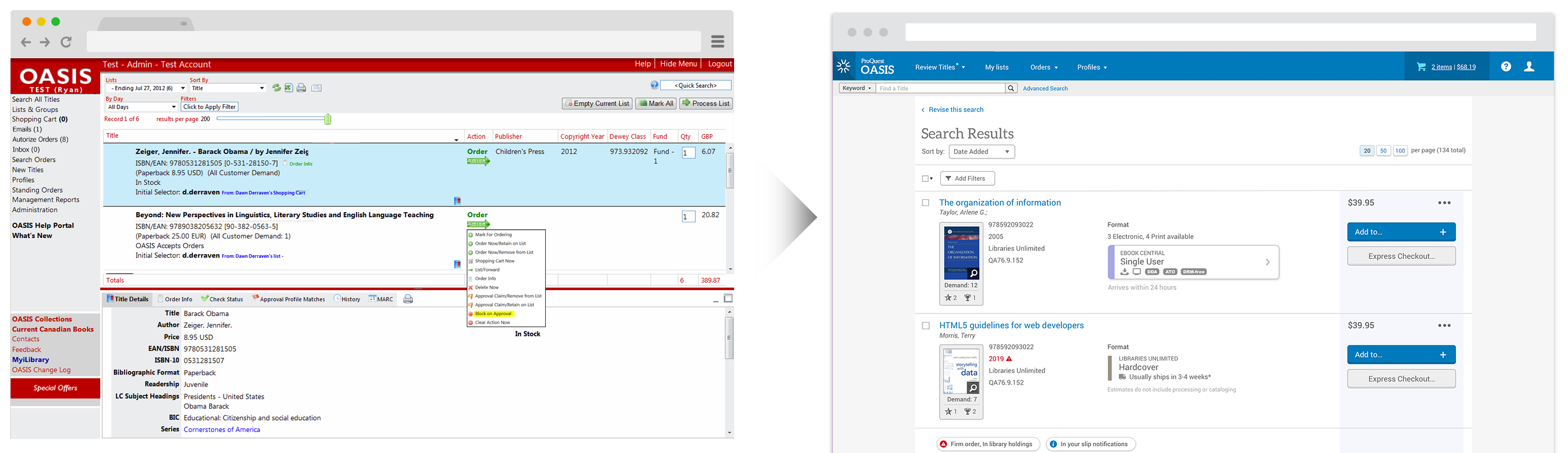
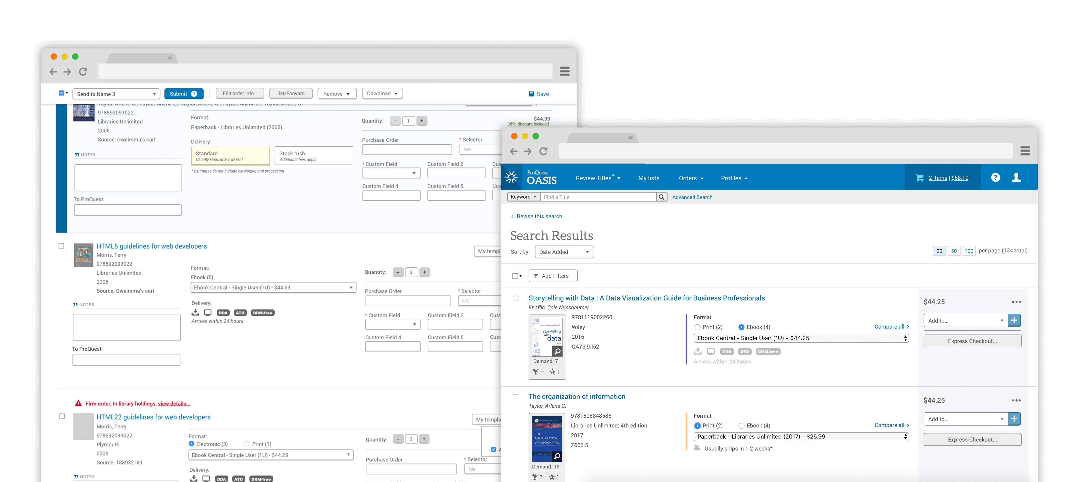
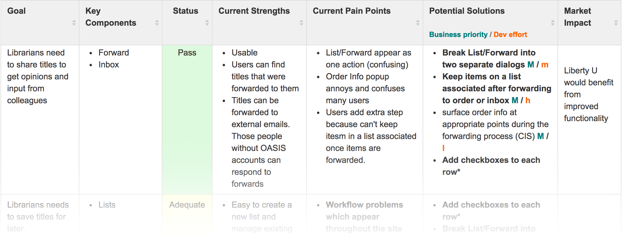
Phase 1: Checkboxes
I discovered that one of the main sources of excessive clicking arose from an unorthodox method to perform common actions on a title such as ordering, forwarding, and adding to cart. The method also created a lot of confusion and usability problems. As a result, the team’s first step in improving the usability of the product focused on replacing this UX model with a traditional checkbox interaction behavior.
From a design strategy standpoint, this initiative was chosen because:
- The new design drastically reduced the amount of clicks needed to complete many common actions
- The introduction of a familiar UX pattern made the product more intuitive and easier to use
- It affected nearly all pages and workflows which meant a large percentage of users would encounter and appreciate this improvement. Remember! We had impatient customers who were threatening to leave
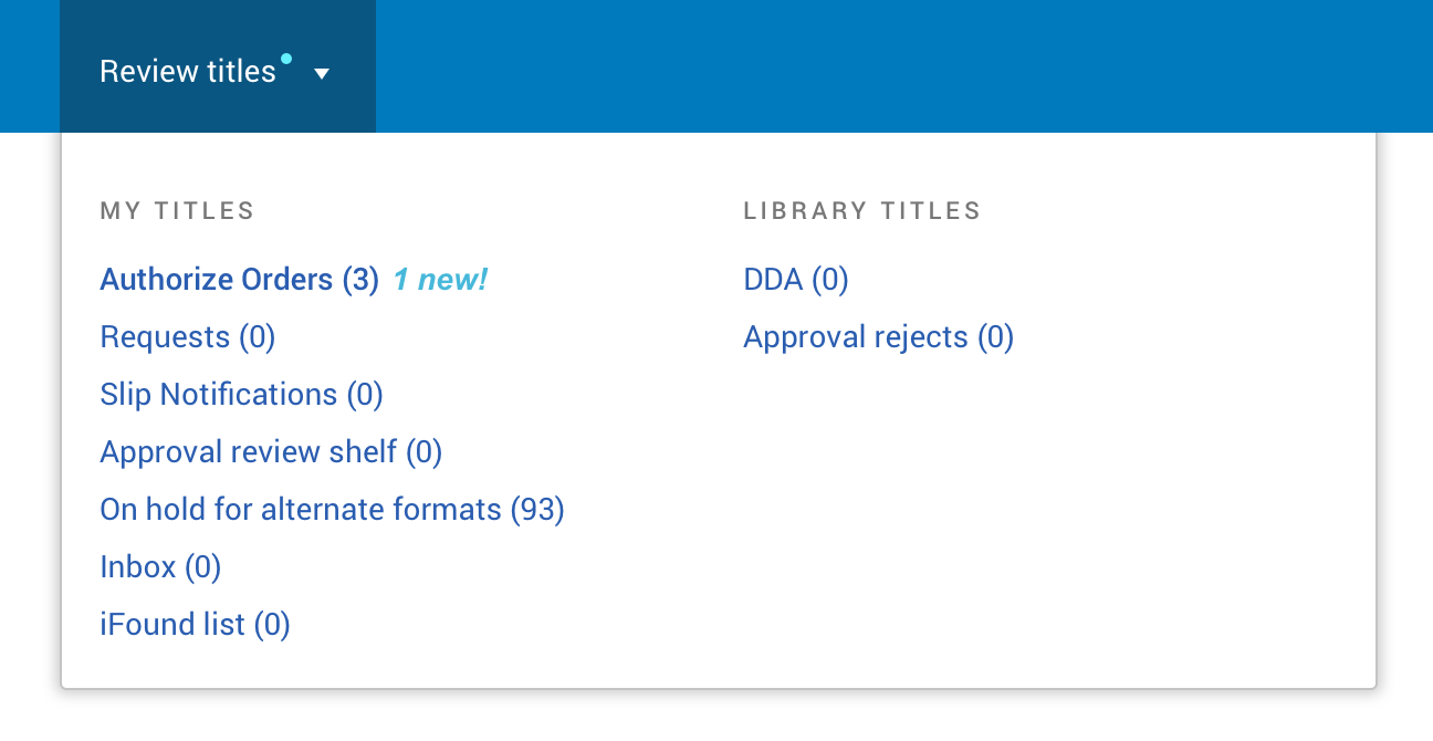
Phase 2: Navigation
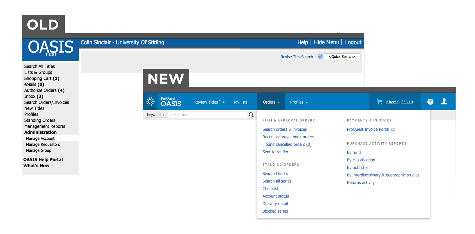
As I evaluated the primary causes behind the cluttered and confusing UI pain point, the navigation emerged as an especially strong candidate for Phase 2 of the Design Roadmap for numerous reasons:
- Reorganizing and renaming pages made the product more approachable. Users didn’t feel anxious or intimidated by a wall of navigation options they didn’t understand or feel obligated to explore
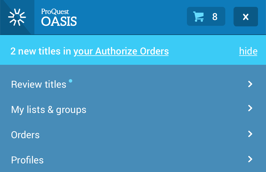
- Hiding visual complexity behind dropdowns considerably decluttered the UI across nearly all pages in the product. This addressed one of the top complaints users had about the old version of OASIS.
- It was important that the navigation remained consistent across all pages as future changes got phased in. The navigation could not change or cause disruption when the user switched between old and new page designs.
- The introduction of this UI element allowed us to introduce the company’s design system which refreshed the overall look and feel of the product for very little additional development cost.
My research consisted of several cardsorting sessions with various cohorts of users. I asked them to organize the page nodes into whichever categories they felt made the most sense. Based on feedback from those sessions, I created an initial navigational framework and revised it several times with users and colleagues.
A few pages did not fit cleanly into the categories I created. I spent a substantial amount of time exploring how librarians regarded these borderline pages to ensure they appeared intuitively within the new navigation.
The feature rollout progressed exceptionally smoothly. All usage metrics and other feedback channels suggested to the new navigation was a huge success.
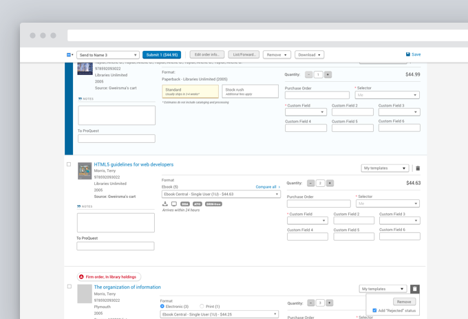
Phase 3: Checkout
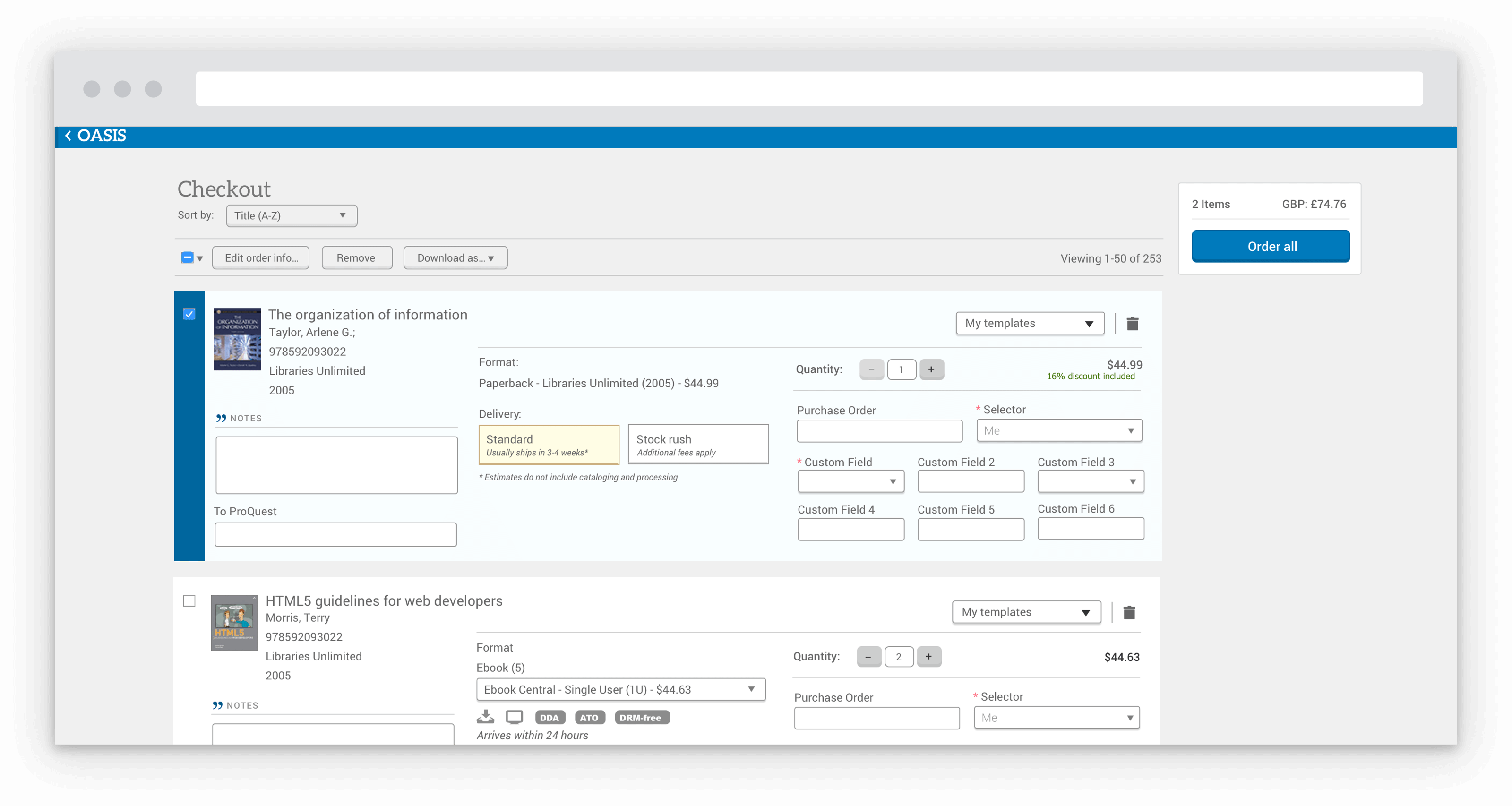
The team then focused on consolidating ordering-related activities into dedicated checkout screens. Previously, users could check out titles from anywhere in the product which led to ordering mistakes and extra clicking because ordering information had been jammed into the crevices of the UI. As a result, the team felt that dedicated ordering pages would greatly simplify and focus the overall user experience and ultimately help advance us towards our product vision.
In addition, we found opportunities to repurpose the checkout design and transform the experience of a large cohort of our users: Acquisition Librarians. Since these librarians mostly focused on the ordering and fulfillment of titles, most aspects of the checkout interface complimented their daily workflows. As a result, the team applied a modified checkout experience which streamlined many of the core Acquisition-related workflows.
Measuring & Achieving Success
The product team continuously gathered customer feedback during this process through several feedback channels:
- Regularly met with a User Group composed of librarians from 13+ Academic Institutions from across the world
- Monitored and acted on an Idea Exchange where any customer could submit and vote on product improvement ideas
- Regularly contacted sales and customer service representatives
- Periodically sent out a surveys to all customers
As for the survey, we set baseline metrics a few weeks before releasing our first round of changes. Six months later, we followed up with a nearly identical survey. The surveys provided some useful and encouraging insights:
- Our Net Promoter Score (NPS) score jumped by an impressive 12 points. We observed a considerable shift from detraction to neutrality
- Users reported improved sentiments about nearly all the major features in the product
- We observed a slight drop in satisfaction with search functionality
- Some overall gains in business metrics were attributed to the team’s UX improvements
After some investigation, we uncovered that the dip in satisfaction with the search experience was largely driven by us repositioning a search element which made it more prominent. We discovered that this particular search element had some deficiencies we had overlooked. As a result, we had inadvertently driven users to a suboptimal search experience. We responded by improving that particular search experience while also rolling out subsequent phases of the product roadmap.