SURVIVEiT Cancer Care Tool
ROLE
Product Designer
2019-2020

TOOLS
Sketch
InVision
Confluence

SKILLS
User Research
Product Design
Prototyping
Design Strategy
Often when you speak with cancer patients, they will likely recount an especially disorienting, stressful, desperate and overwhelming period of time when they’re first diagnosed or in a transitionary period in their treatment. They find themselves unexpectedly getting thrusted into a labyrinth of unfamiliar medical protocols and face life or death questions they often don’t feel qualified to answer on their own.
Search online and you’ll likely find that most cancer resources don’t do a great job at alleviating those pain points. Most often, they fail to connect patients with personalized, actionable and relevant information which answers their most pressing questions about their specific health situation.
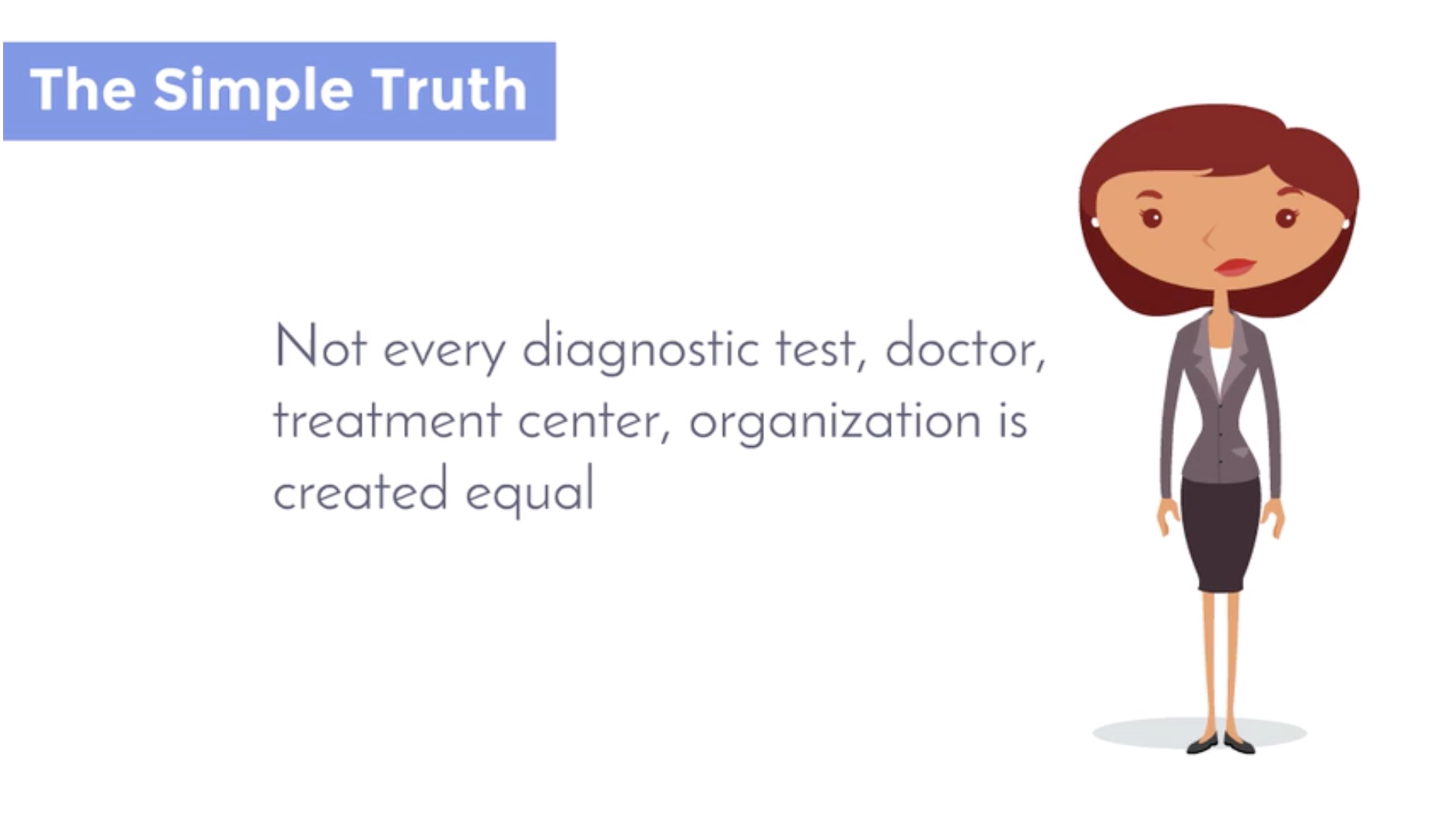
Medical professionals don’t always do a great job at guiding patients towards the best options for their condition either. Often, doctors will only recommend familiar treatment options which are available at their institution. This often leads to patients making uninformed decisions based on incomplete information about their medical condition and treatment options.
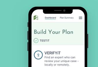
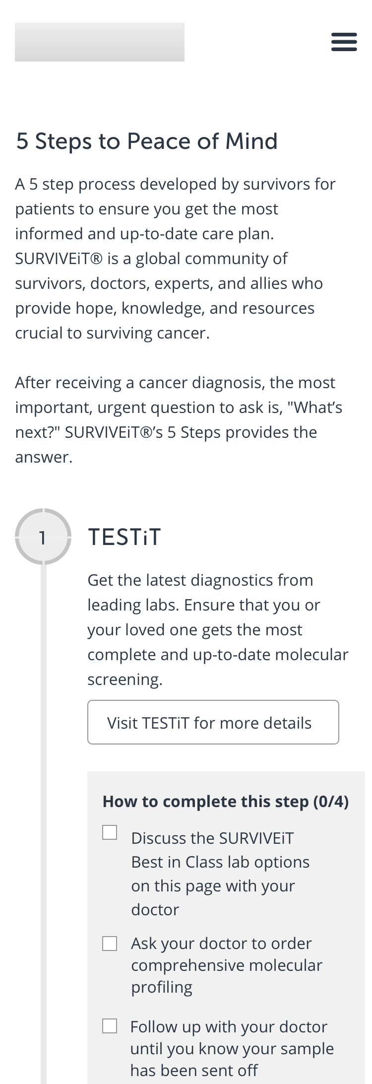
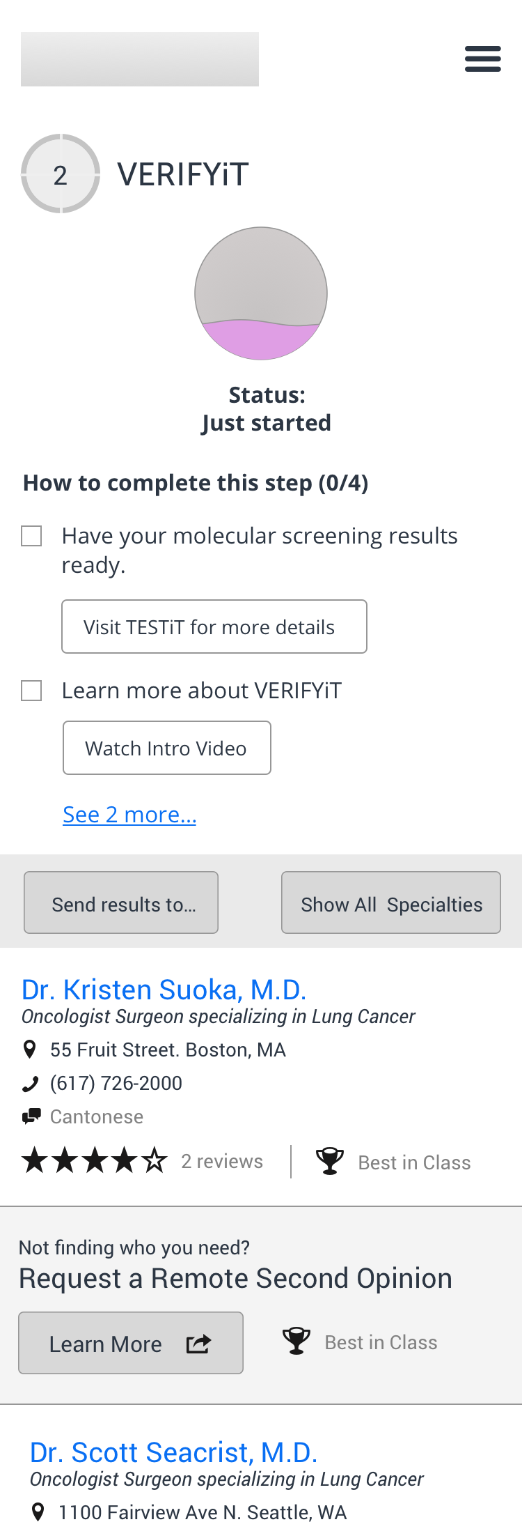
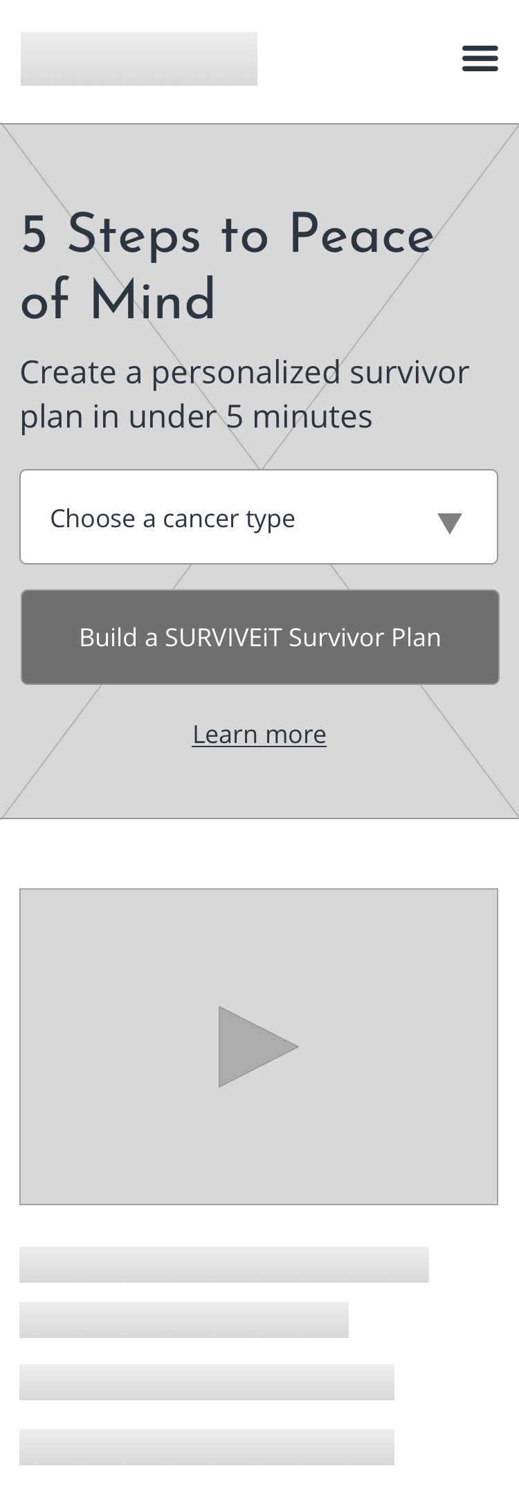
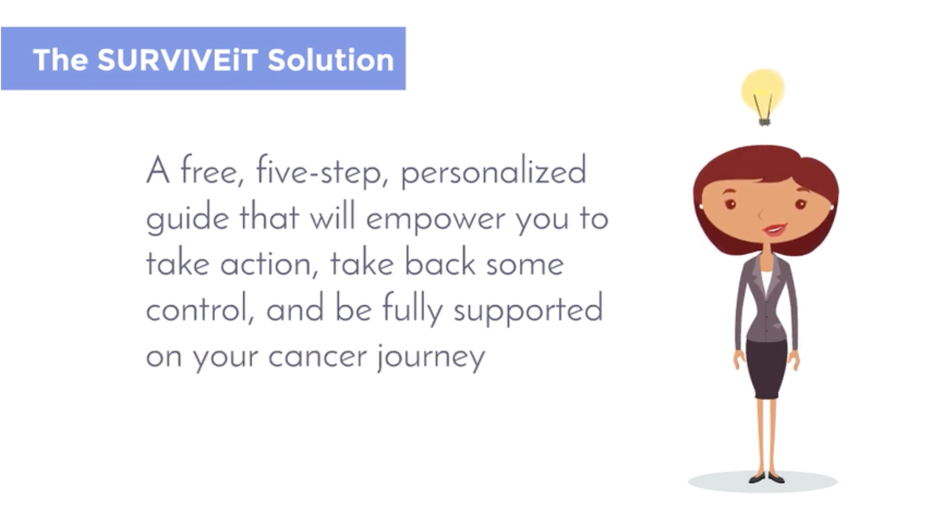
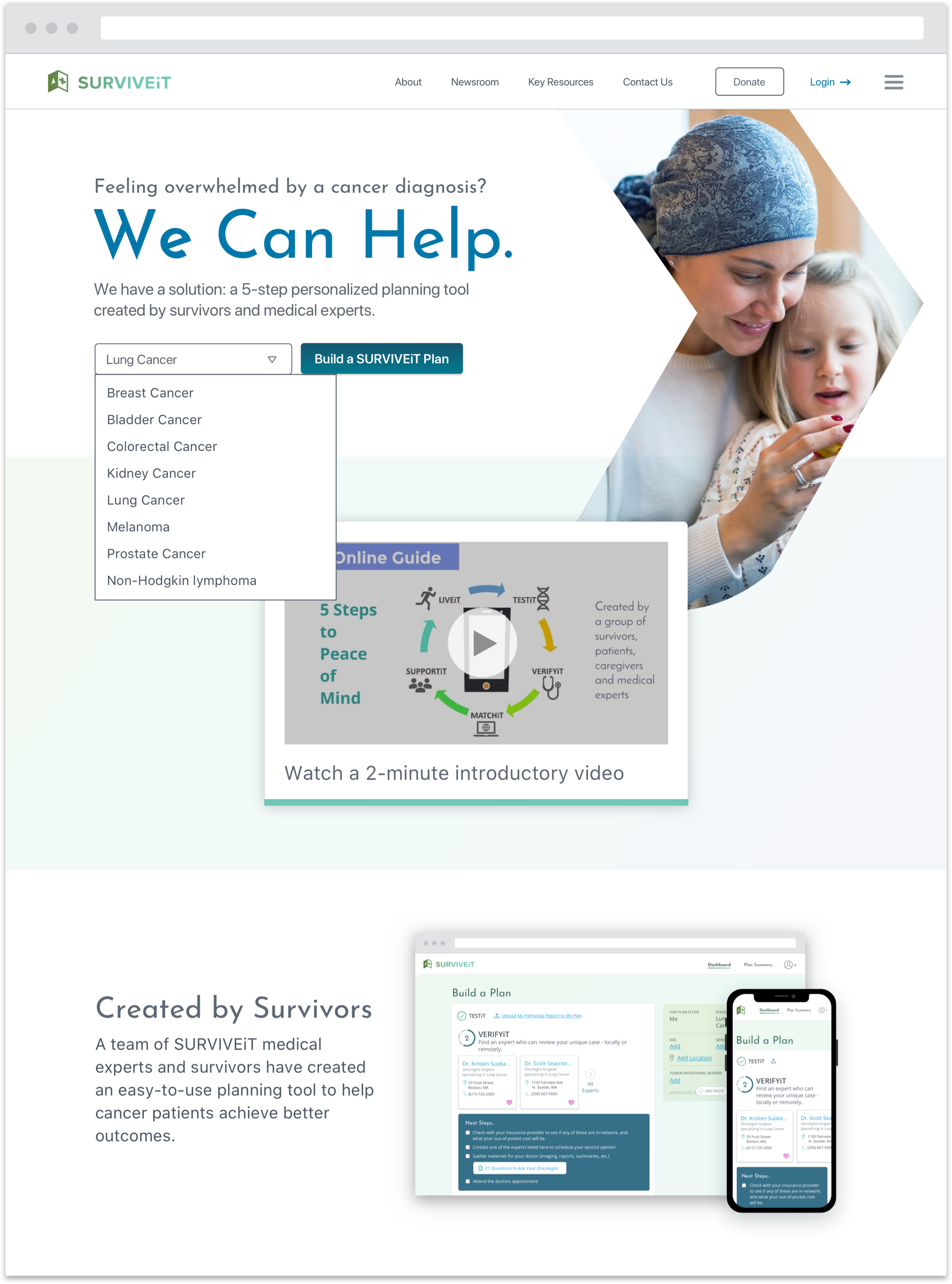
Created by cancer survivors and medical professionals, SURVIVEiT’s new comprehensive planning tool walks cancer patients through a straightforward five-step process which helps patients make better, more informed decisions and point them towards better health outcomes.
Audience
This new tool primarily targets cancer patients who have searched online for additional resources related to their health condition.
Most often, users are:
- 45-65 years old
- Female
- Proactive about learning more about their health condition and finding additional treatment options
- Doesn’t blindly accept everything her medical care team tells her
- Afflicted by lung cancer
Users often experience powerful emotions while interacting with the tool such as feeling:
- overwhelmed
- hopeless
- powerless
- scared
- disoriented
- potentially in denial
User interviews revealed that SURVIVEiT’s tool needed to also disproportionately focus on patients:
- who don’t always trust the judgement of their medical care team
- with a rare form of cancer
- with a grim prognosis and low chance of survival
- who are in a transitional period with their treatment
In addition, the tool also needed to serve caretakers. Often, a proactive family member or friend would turn to SURVIVEiT to research their loved one’s condition and treatment options. A caretaker would leverage their research findings to facilitate conversations with the medical care team.
Approximately half the users accessed the website via a mobile device while the remaining users accessed it through a desktop browser.
Discovery & Iteration
I worked closely with the SURVIVEiT’s Executive Director and a Product Manager as the sole designer to:
- define the scope and primary featureset
- design the product experience
- develop a new UI look & feel
- lead the user testing and validation processes
- facilitate implementation with an offshore development team
- manage and work with junior designers
The team provided me with an outline of the five steps they wished to feature on the site along with a rudimentary branding and style guide. Most of the challenges I faced centered around propelling cancer patients and caretakers through a five-step process which helped them make more informed care decisions and achieve better health outcomes.
The team’s first round of testing with users centered around the following questions:
- How well do users understand the overall value of and progression through the five step process?
- Do new users feel compelled and comfortable progressing through the sign up experience? Which pieces of information do they need to feel compelled to click through the process?
- How do users prefer to save and share their plan with others?
- Will users rely on a series of short videos to help navigate through the five step process?
- Which feelings do the look and feel invoke?
- Does the five step process align with their needs and goals? Which additional features might also help users when considering their cancer care?
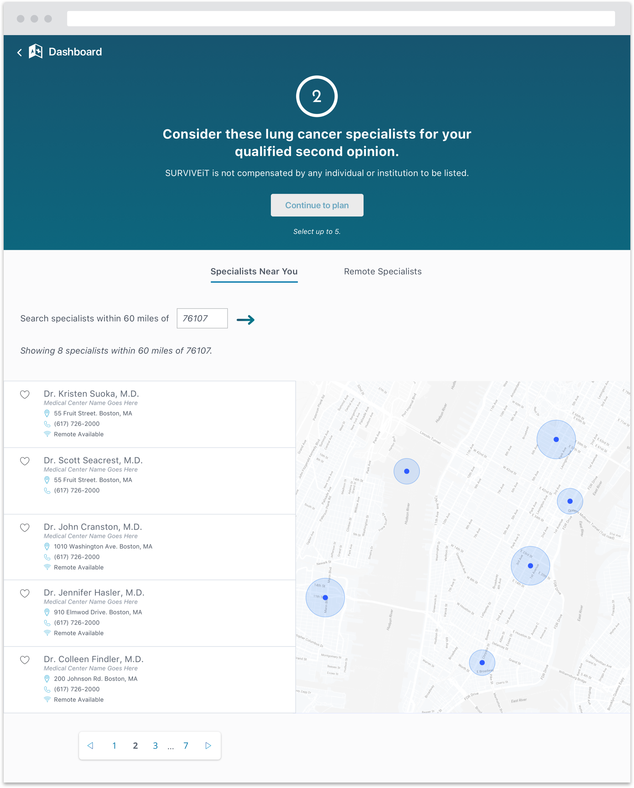
The team scheduled a series of one-on-one interviews with cancer survivors and caretakers. I spent the first portion of the session asking the user background questions about their relationship with cancer and progression through treatment. I devoted the second half of the session to a prototype which allowed users to walk through the sign up process and five steps.
Key User Feedback
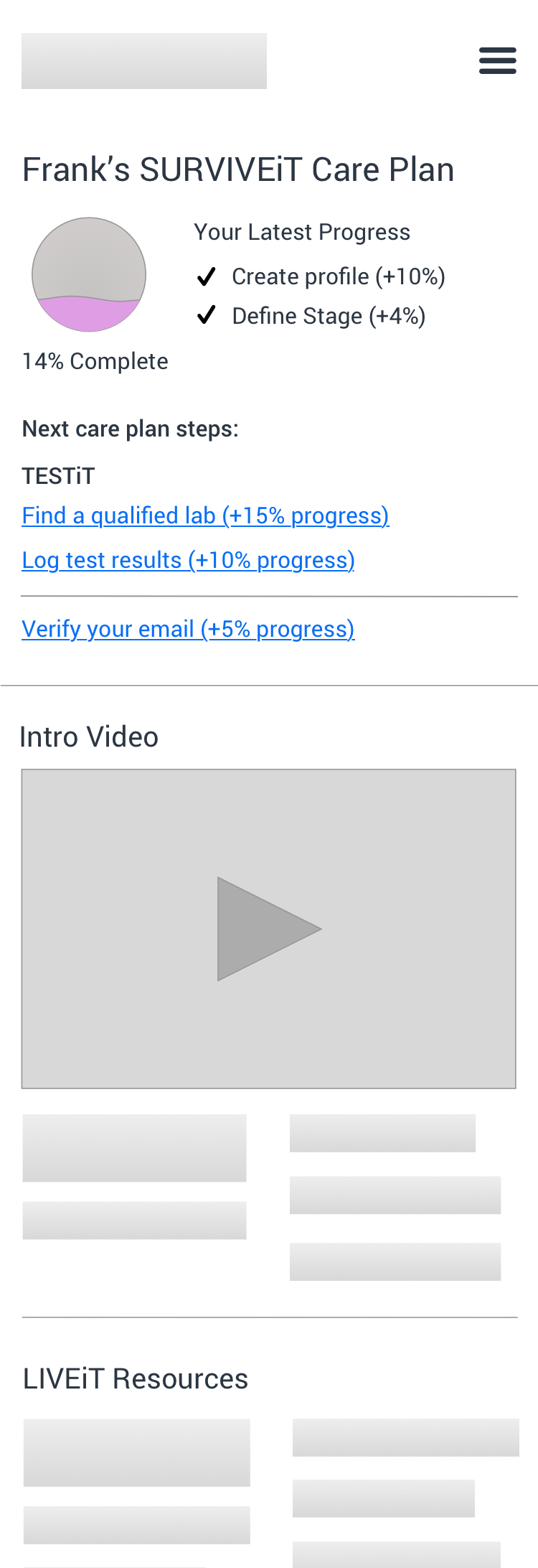
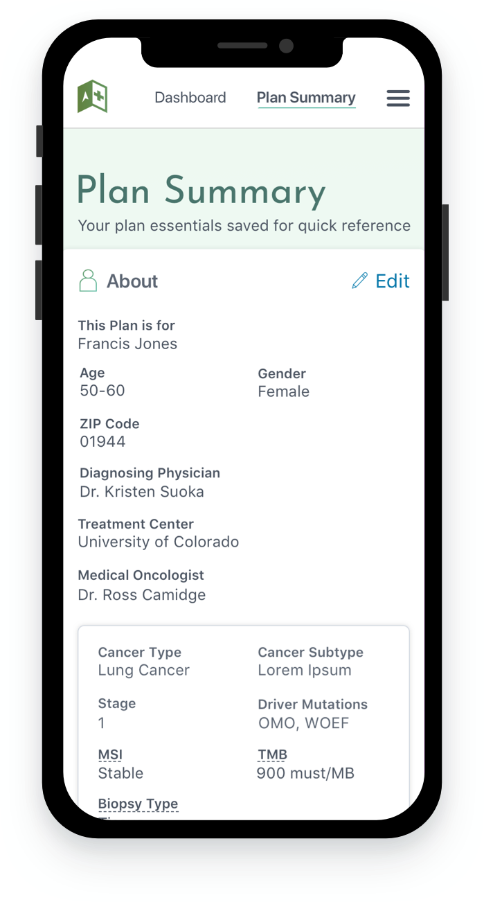
- “I like that I’m building a plan but where is my plan?”
- “I’m not sure what this progress meter is telling me. The latest progress with my cancer or this plan?”
- “I’m not sure what to do next. Do I click the meter or the numbers up top?”
- “I wouldn’t do much with the ‘About Me’ section. Why do I need to fill in my age, gender and other health information?”
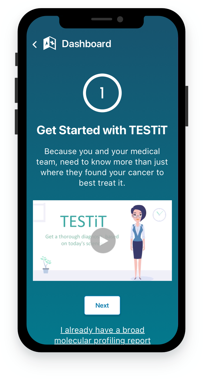
- All users attempted to click on the videos to learn more about the product
- All users preferred to interact with the five steps via the progress meter across the top of the page
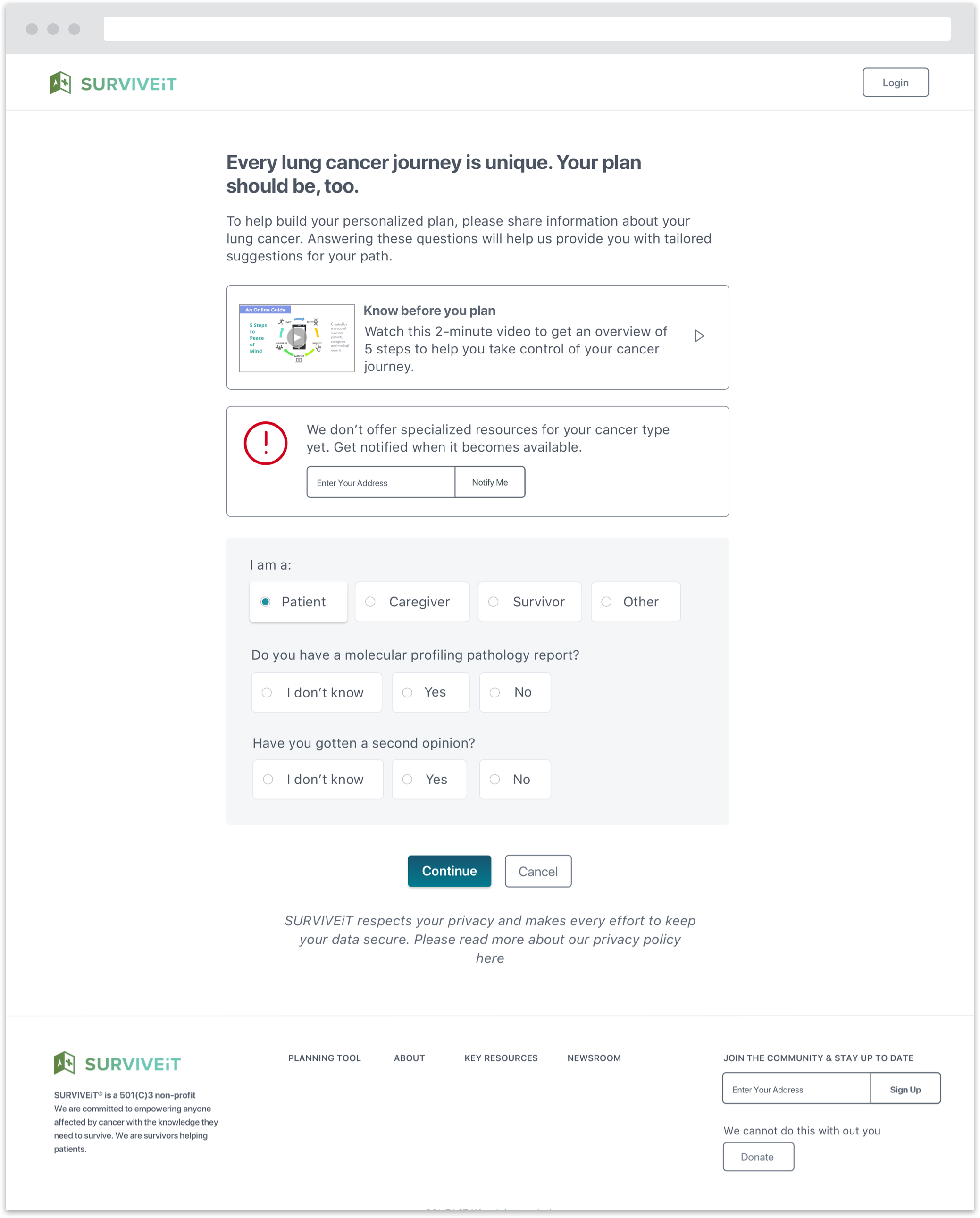
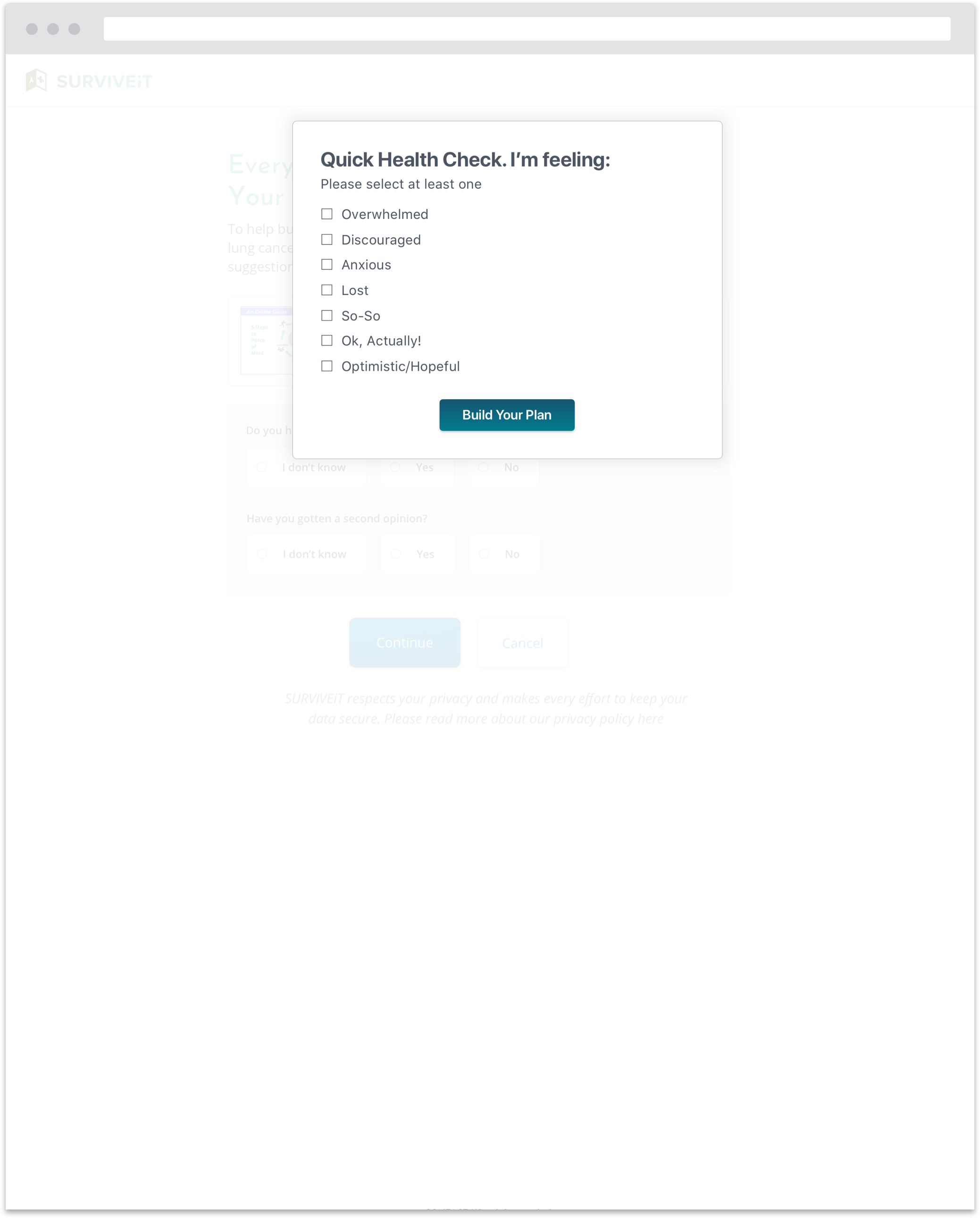
- Users often expressed concern about sharing personal health information. They wanted to know why we were collecting their personal information and what we would do with it
- Users preferred to save and share their plan via email or by saving a PDF file onto their device
Key Design Changes
The team decided to change key pieces of the prototype to address the user testers’ most poignant feedback:
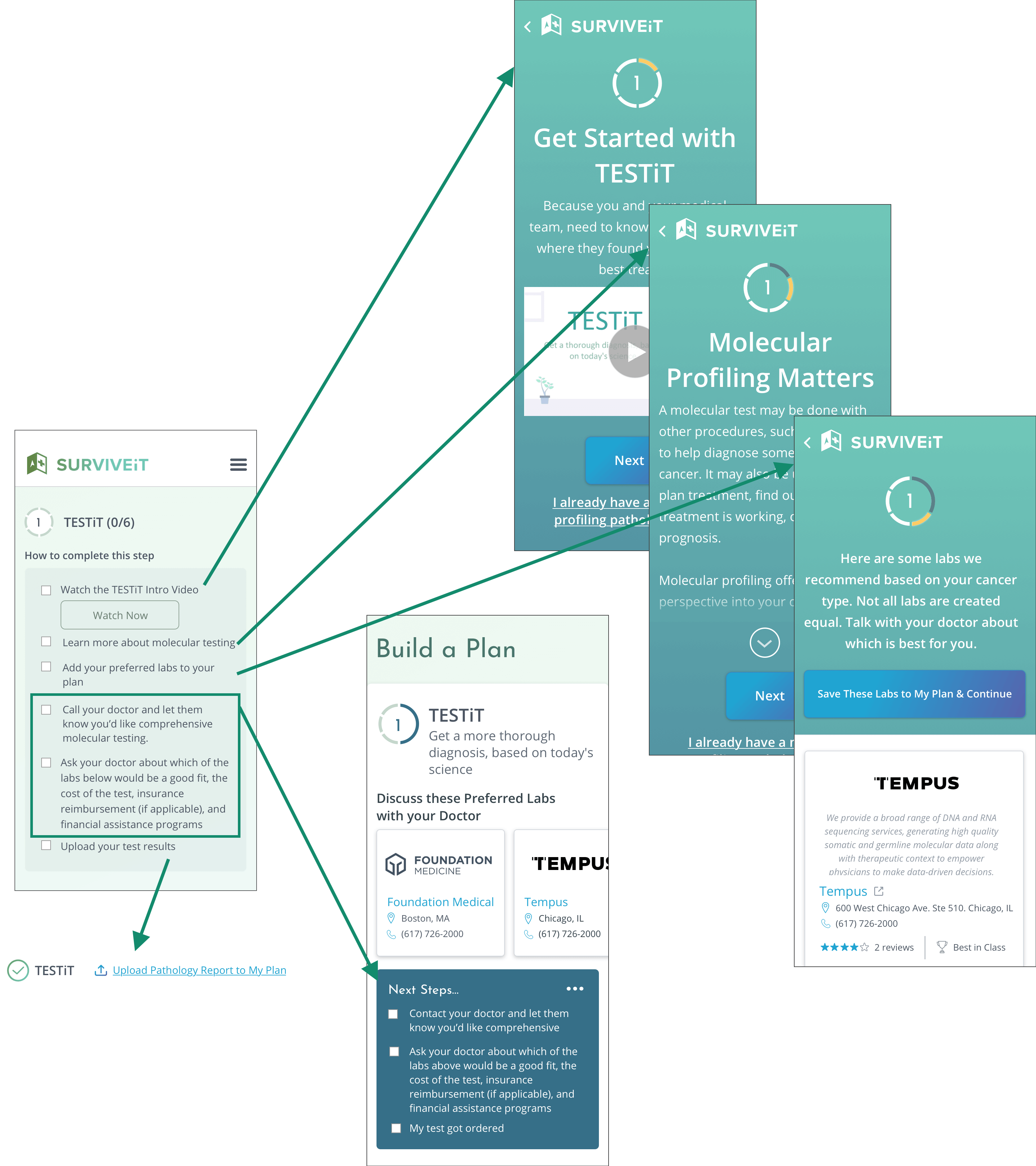
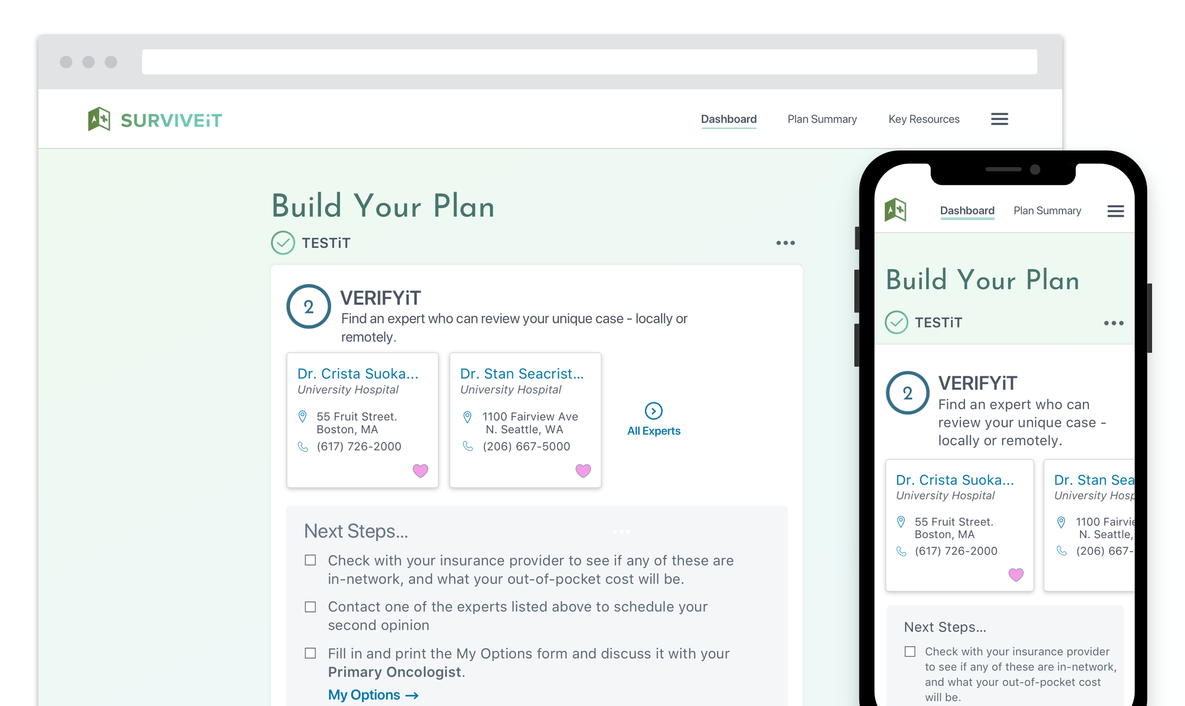
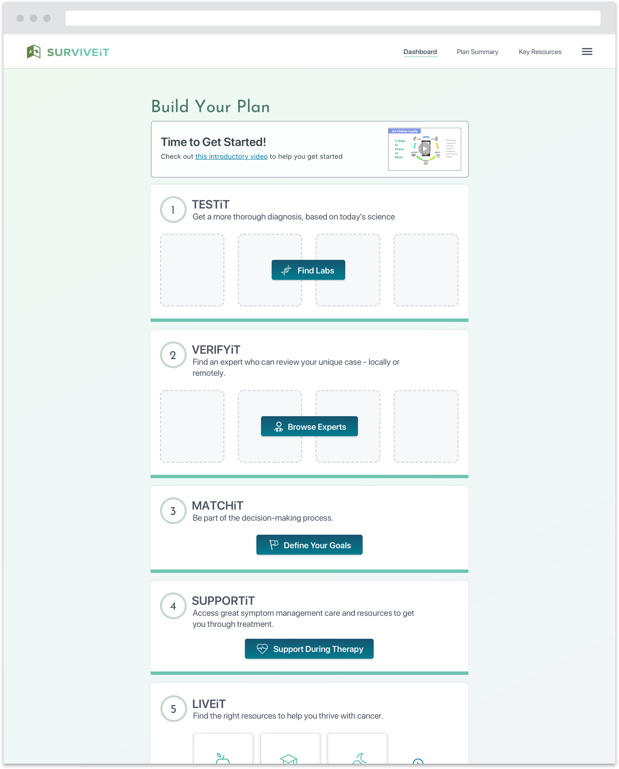
Center the dashboard experience around the progression through the steps
Users preferred to click through the steps using the progress meter across the top of the page. Moreover, this presentation helped users understand what the tool did and compelled them to use it.
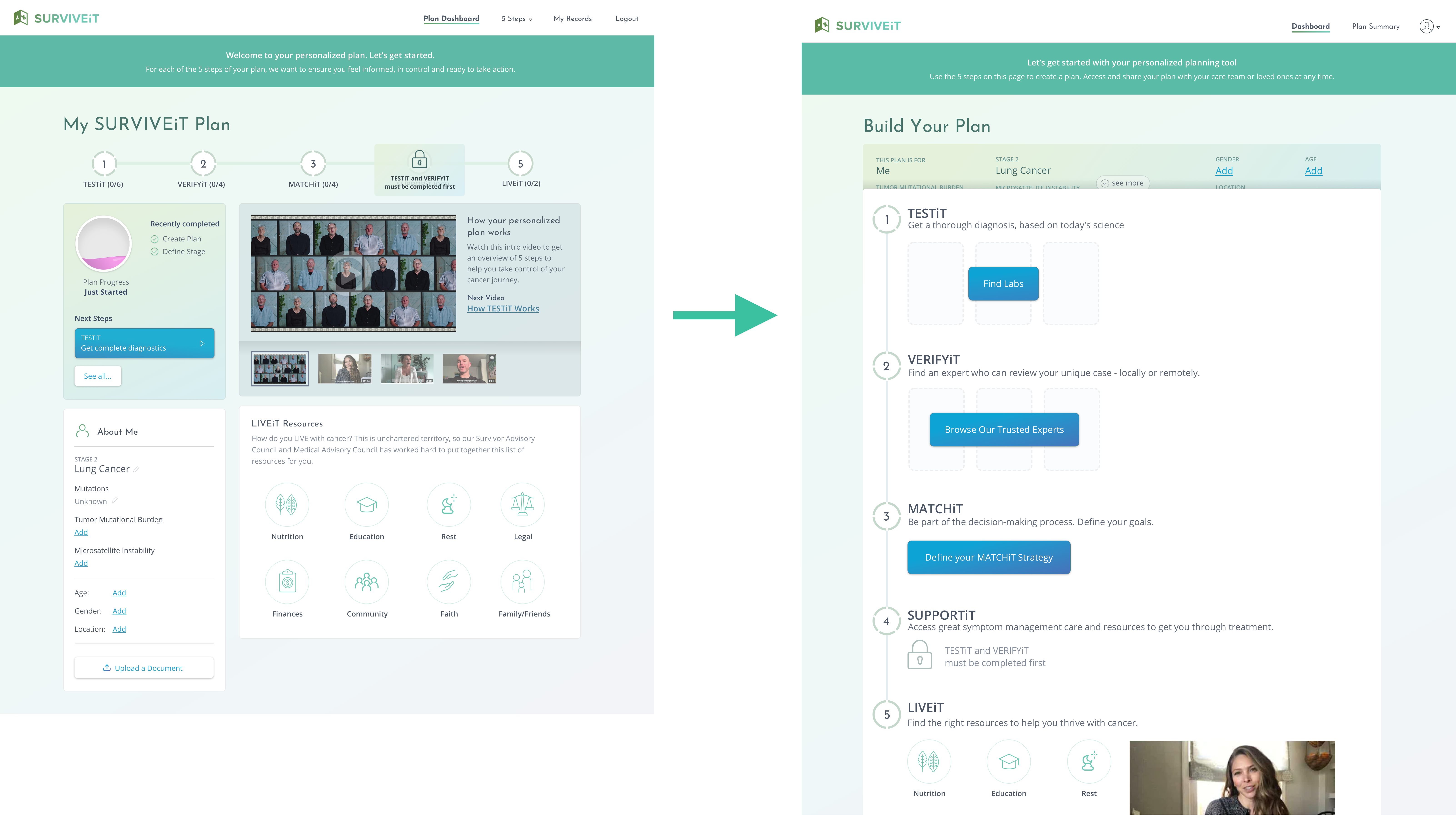
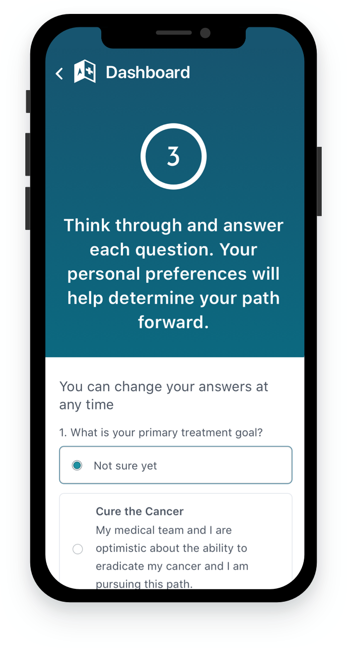
Clarify how users progress through the five steps and track their progress
Users commented that they didn’t always understand what they had already completed and what needed to be completed next. The updated design broke apart most action items and layered them into a progression which nudged users in the right direction in a more timely and intuitive fashion.
Create rough cuts of the videos and offer them in the prototype
Users seemed open to learning more about the product from short videos. The team created rough versions from generic templates which users viewed during subsequent testings.
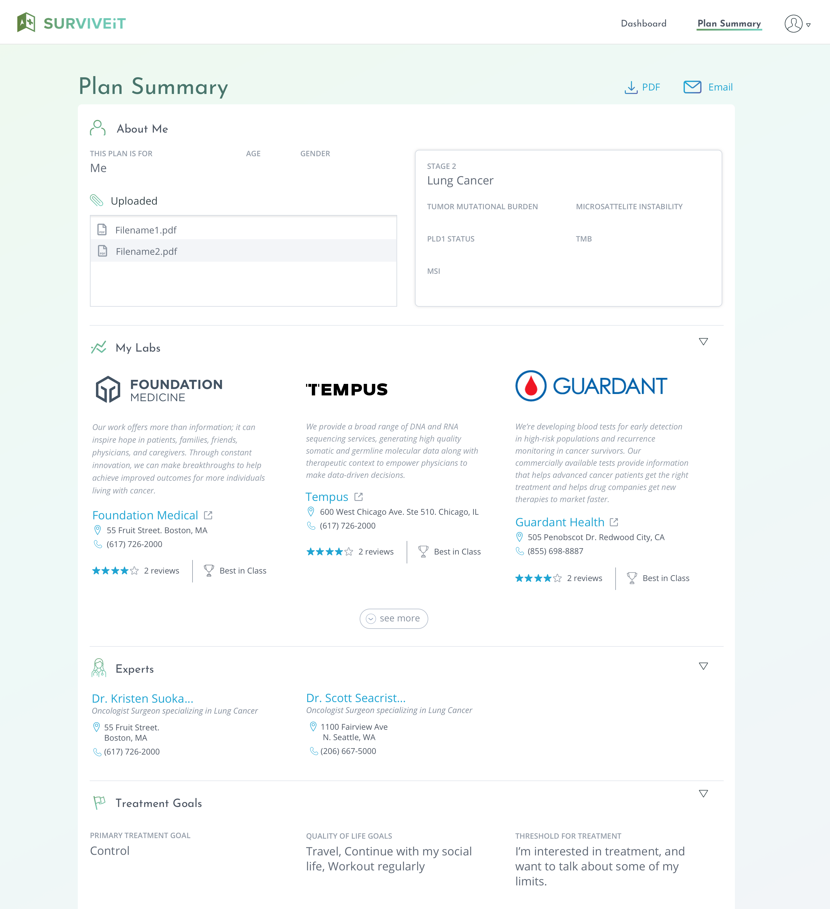
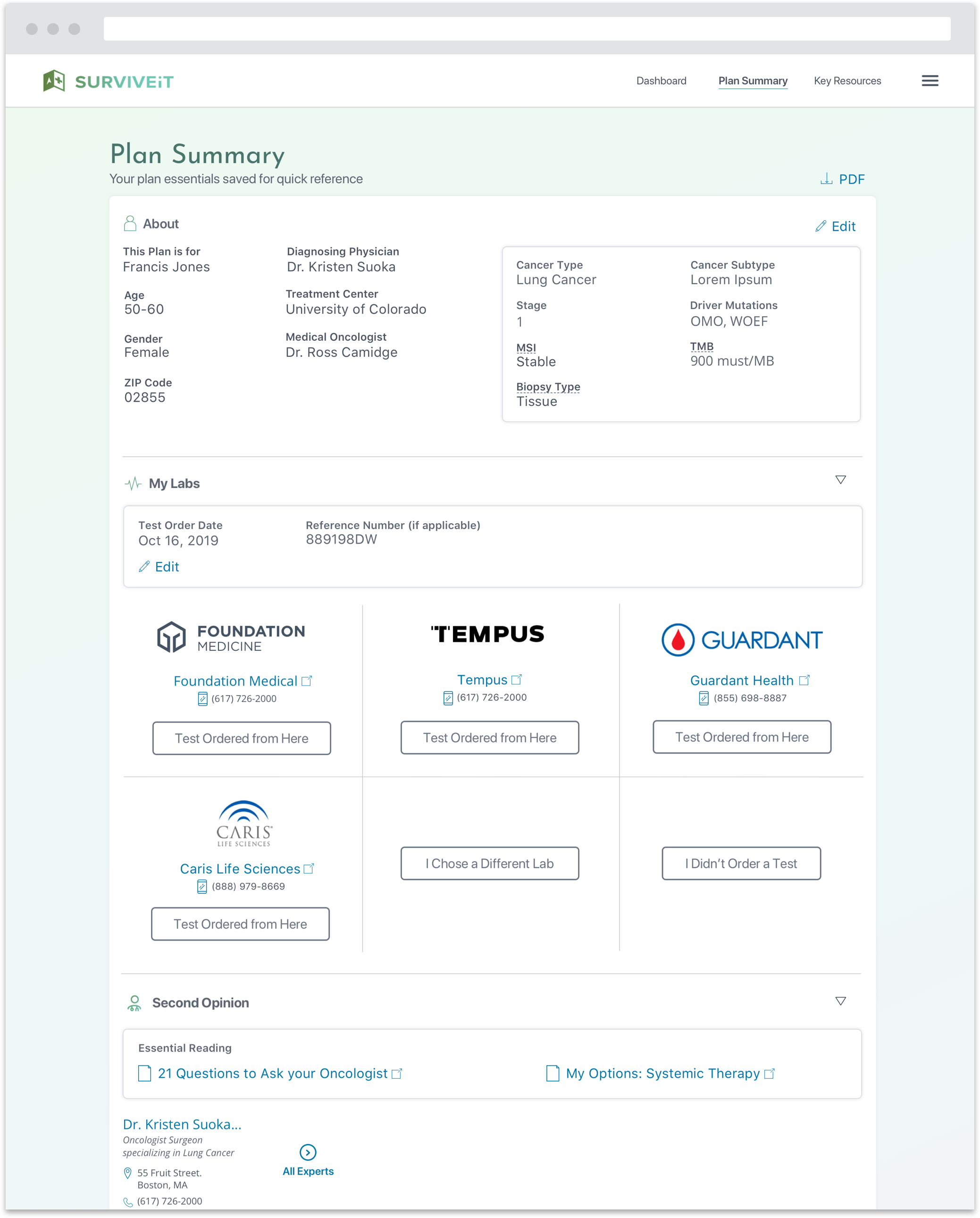
Create and test a new Plan Summary page where users can review, save, track and share their progress with others in one centralized location.
Solution
Subsequent rounds of testing revealed that we had made welcomed improvements to the experience. Users seemed to better understand the overall purpose of the product and progressed through the steps much more fluidly and intuitively.
Additional rounds of user testing instilled confidence in my design updates. As we moved towards implementation, we made some key updates:
- Offer a guest option so that users can try out the experience before creating an account
- Introduce more flexibility into the steps so that a user can skip a step or take an action that’s not explicitly recommended by the tool
- Layer in additional messaging after a user returns to her dashboard after completing an action
- Evolve the visual design and ensure it complies with accessibility standards.
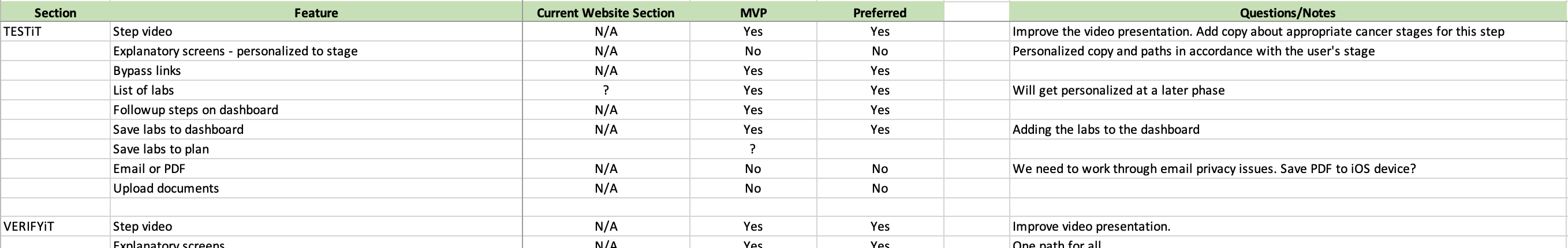
I also led a prioritization exercise where the team discussed and agreed upon an MVP featureset and phased implementation strategy.
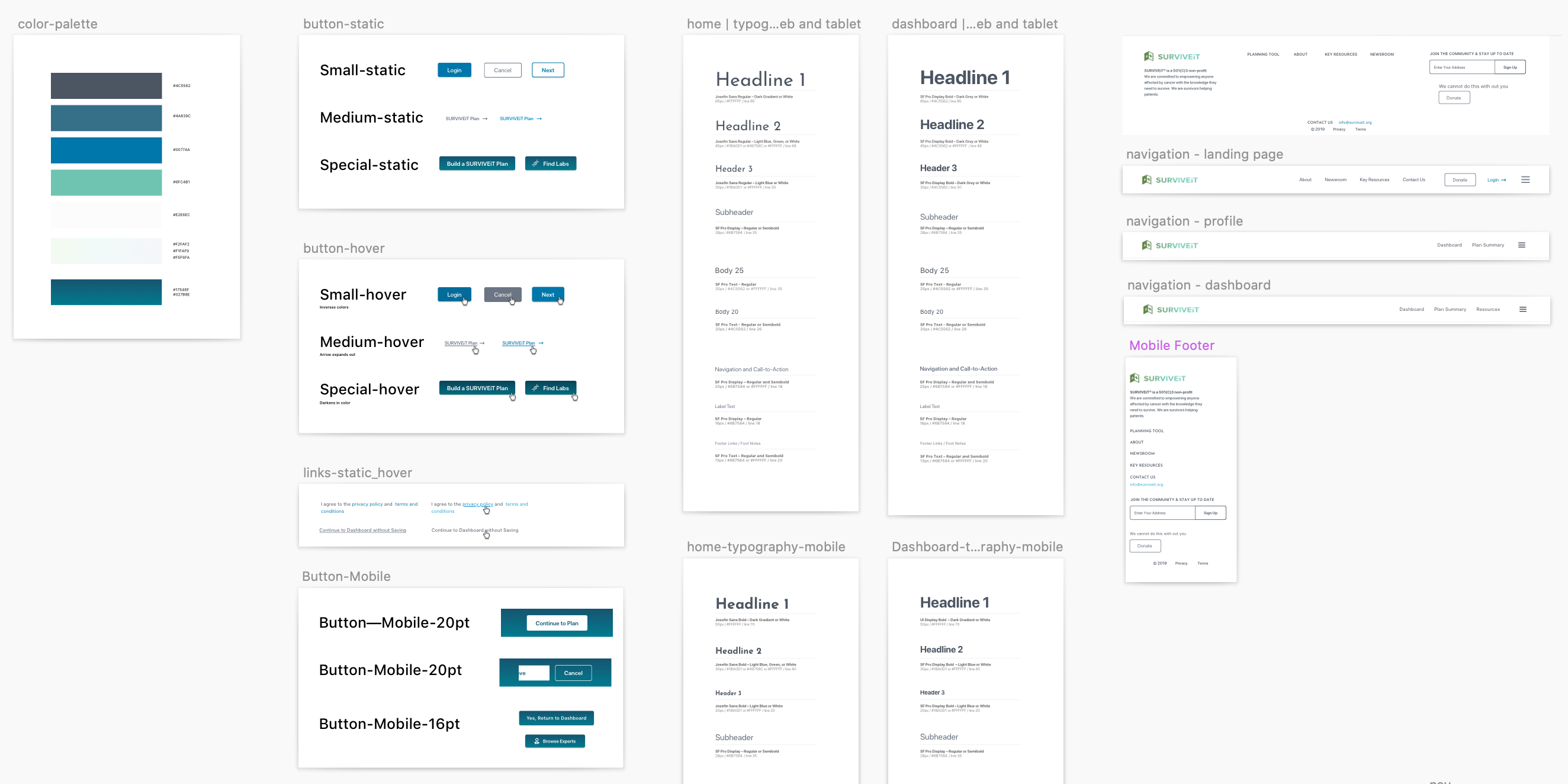
I also collaborated with other designers to develop a UI component and styling library to help streamline and simplify the implementation process.
What I Learned
- Great design stretches beyond simply meeting business objectives. Design has the power to help people find meaningful and better paths forward while alleviating the stresses of life’s most painful situations.
- Tone and phrasing matters. When writing copy or speaking with users in testing sessions, I devoted considerable thought to how I would approach certain subjects and product concepts. Most users I spoke with had recently experienced a momentous and painful life event. My personal demeanor and the demeanor of product as a whole needed to account for their emotional state while also projecting transparency, honesty and credibility.