
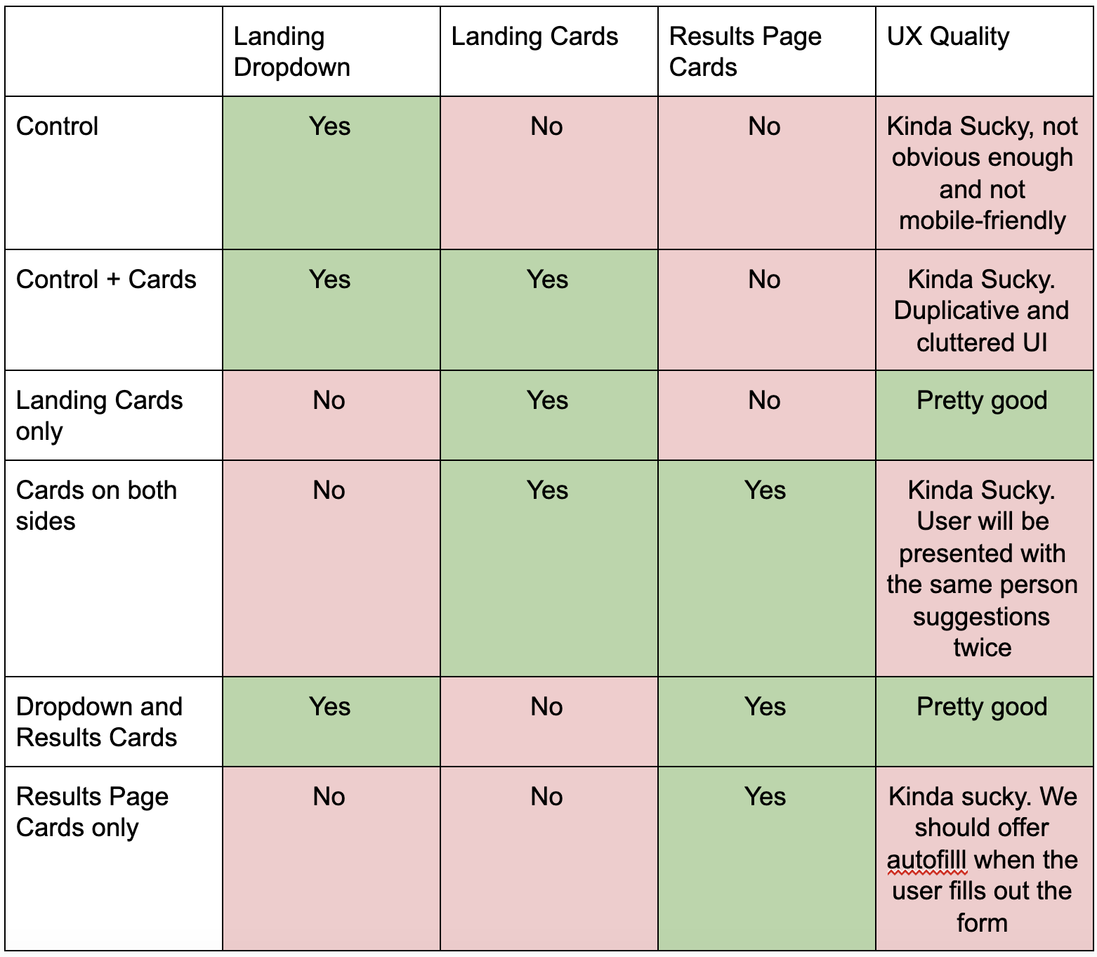
Search Clean Up
ROLE
Senior UX Designer, Search
2021-22

TOOL
Figma

SKILLS
UX/UI Design
User Testing
System Design
Split Testing
The Problem
Ancestry’s search results experience possessed a long list of usability inadequacies. The experience:
- did not strictly adhere to a grid or utilize consistent text styling conventions
- utilized misleading and confusing language to describe critical content and functions
- overwhelmed users with data and options due to a lack of visual hierarchy
- displayed cluttered and confusing content which made it difficult to introduce new features
- used colors and patterns which did not comply with accessibility standards
These inadequacies not only confused and overwhelmed newer users but they also introduced friction when introducing and drawing attention to new features. As a result, I spearheaded and led an effort to clean up and transform the search results experience. Importantly, the changes could not negatively disrupt the entrenched habits of more experienced users.
Key Objectives
- Simplify search’s toolset to make it easier to recognize and use
- Align elements to a grid and strengthen the information hierarchy
- Make the page more accessible and understandable
- Partner with the Design System UX Designers to help shepard in and shape the new design system
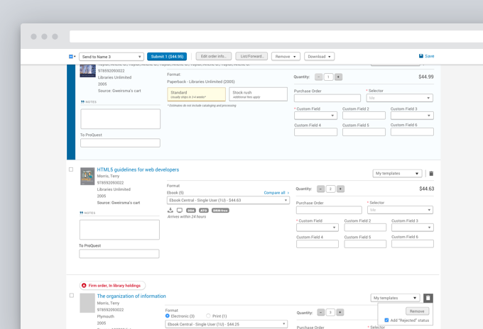
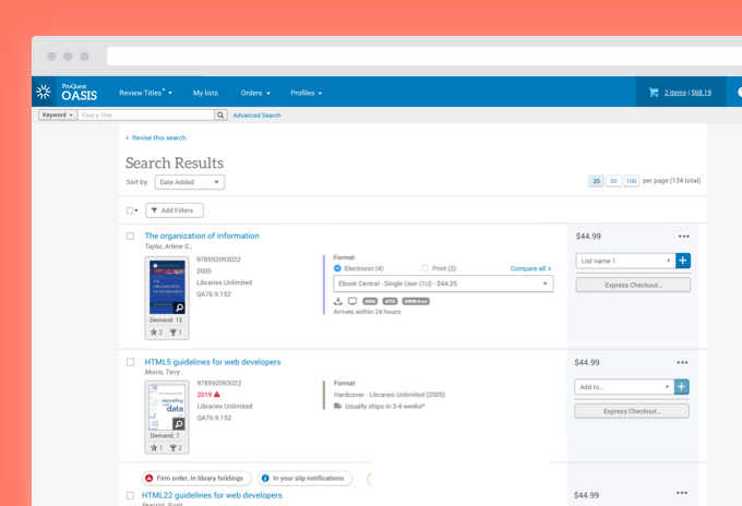
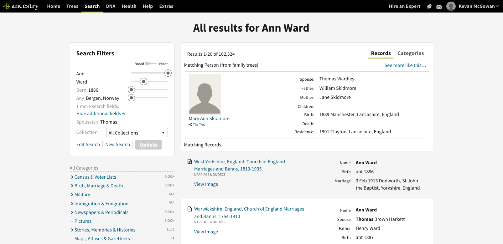
Layout and Hierarchy Improvements
I employed a spectrum of techniques to clean up and clarify the results experience. Firstly, I aligned the page elements more tightly to a grid. Secondly, I applied consistent text treatments and darkened some text to ensure that they complied with accessibility standards. I also shifted the visual emphasis on page elements to ensure that the results themselves appeared most prominent.
These changes helped cut through the complexity by reducing the cognitive load. The changes also helped the user distinguish between primary, secondary and tertiary page elements.
The sessions revealed that
- customers often misinterpreted or failed to notice UI which triggered the automated query function. By probing deeper, we identified some key drivers behind these deficiencies.
- several customers recalled carrying out manual searches which would have benefitted from our automated query function
- several of the design concepts fell flat, others showed promise
Solution
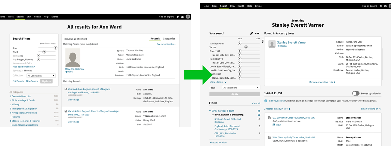
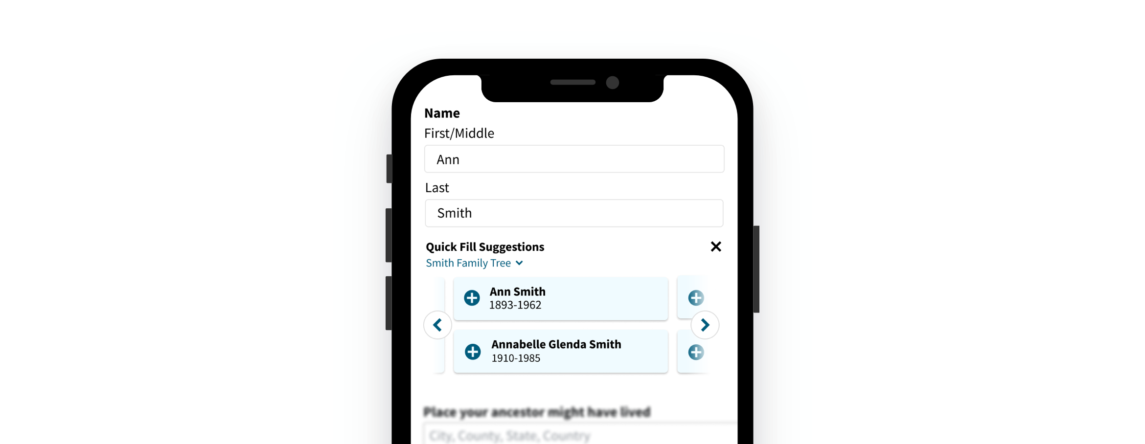
After concluding several rounds of qualitative testing, my Product Manager partner and I analyzed user feedback and set our sights towards implementation and quantitative testing. After weighing factors like implementation cost, opportunity and experience quality, we decided to rework an underperforming dropdown element on the search landing page.
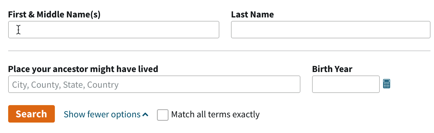
The solution made several significant changes to the experience:
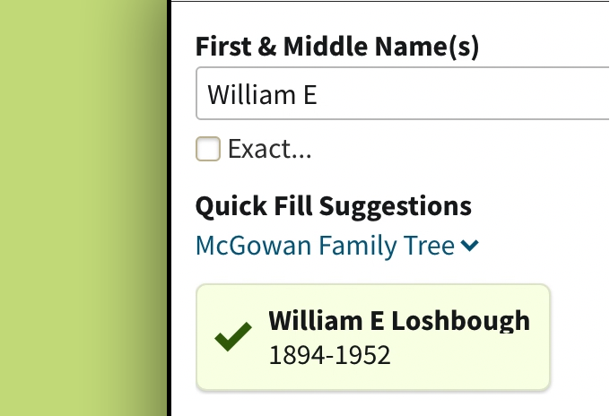
- Replaced the dropdown behavior with a carousel of cards. During qualitative testing, users seemed to more readily notice the updated card treatment. Additionally, the cards offered a larger hit area to aid mobile users
- Labelled the new version “Quick Fill Suggestions.” Users often misinterpreted what the dropdown treatment offered them. The new label helped users better understand how it worked and the depth of functionality it provided.
- Increased the prominence of the family tree name. Because users often work on several family trees at once, it was important for them to understand that the suggestions originated from one of her trees. Also, the increased prominence helped her understand that she could switch if she was searching for someone in a different tree.
Quantitative Feedback
The team split test three different options aimed to measure a few key performance metrics:
- Query Quality. This measured the quality and quantity of information users entered before searching. We hoped that the new design would increase overall query quality.
- Search Success. This measured how often users took positive action on a search result.
- Active Discovery Rate. This measured how frequently users connected with meaningful discoveries across the full spectrum of discovery channels available in the product.
After testing these variants with over 400,000 users, we found some encouraging insights. The new design
- boosted Search Success by 6%. It connected users with more compelling and relevant results.
- boosted the Active Discovery Rate by .5%. It added measurable gains to the larger discovery ecosystem.
- All skill levels benefited but lower skilled users benefited most from the new treatment. Lower skilled users had been our target audience.
What I Learned
- Don’t be afraid or ashamed to lean on your colleagues and customers to reach a better outcome. Input from colleagues and users undoubtedly boosted the quality and outcome of this design.
- The sexiest, most innovative ideas may not offer the most fruitful path forward. I tested a wide range of approaches. Many of the more radical and innovative designs did not test as well. Be honest with yourself and the feedback you receive. Allow users guide you towards the best solution.