Search Results Redesign
ROLE
UX Lead, OASIS
2018-19

TOOLS
Sketch
InVision
Axure
HTML/CSS/jQuery

SKILLS
UX Design
Interaction Design
User Research
Motion Design
When talking about their pain points, users consistently mentioned the title browsing experience as a top area of contention.
Most notably:
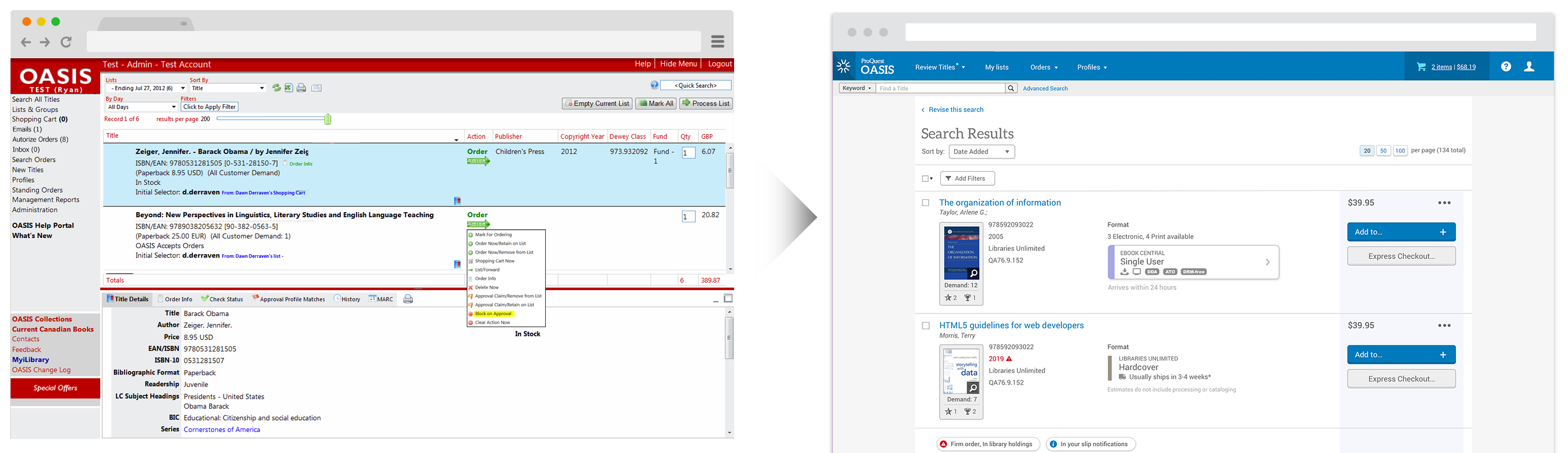
- Title information appeared cluttered and disorganized
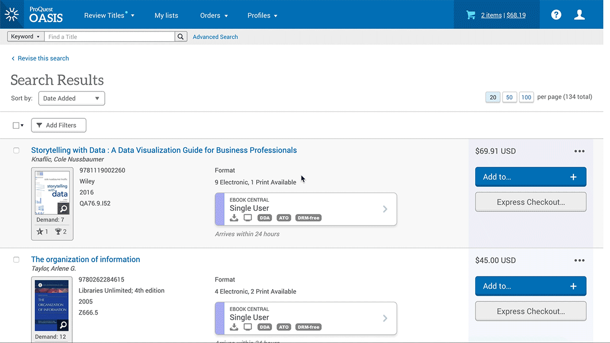
- The Search Page display was confined to a horizontal split screen layout which poorly utilized the screen real estate of the page and this layout exhibited buggy behavior when resized by the user
- The existing interaction model required what users felt were extraneous clicks to complete common tasks
Our competition had largely failed to offer a good quality solution to adequately address these complex challenges. The door had been left open for my team to offer a market-leading title browsing experience where innovative and user-centered design would differentiate and raise OASIS above the others.
Business objectives largely centered around NPS and other user sentiment metrics focused on key features and workflows.
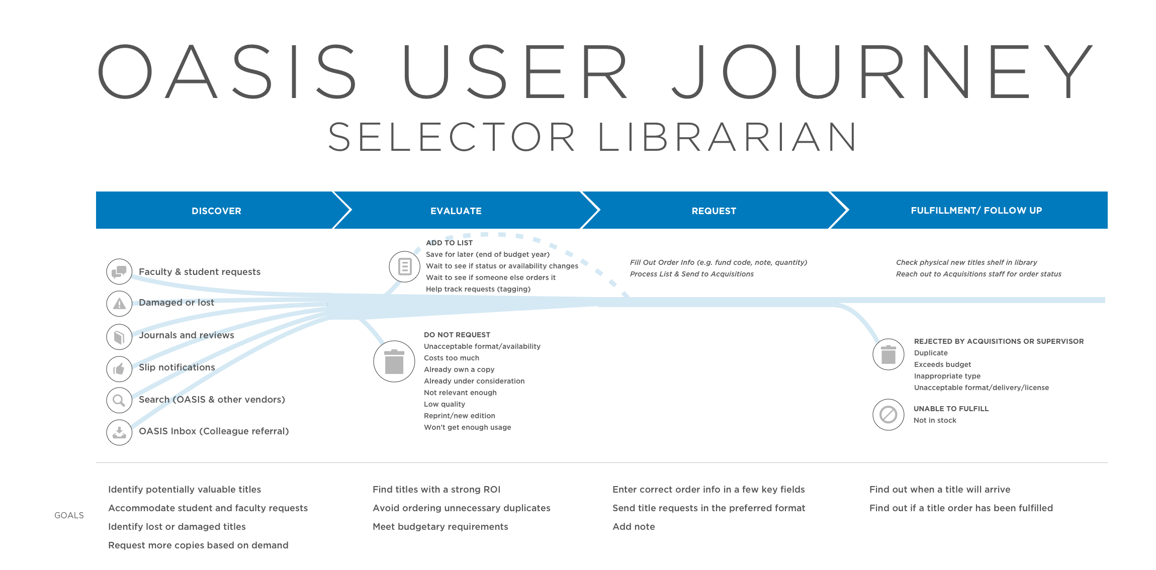
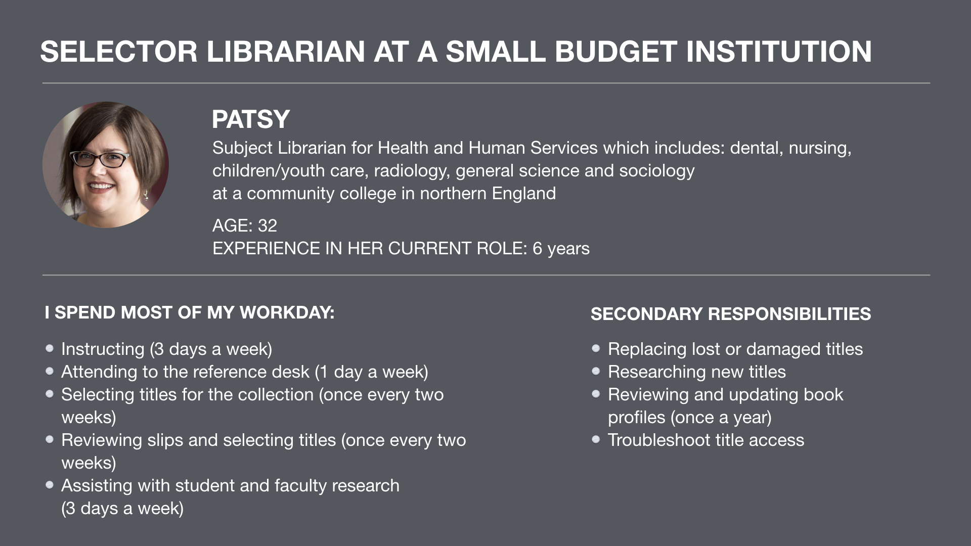
Target Personas
This page primarily served Selector Librarians who often conducted more robust and intricate searches. They commonly drew insights from a wide range of title-related details and system statuses in order to finalize thier purchasing decisions.
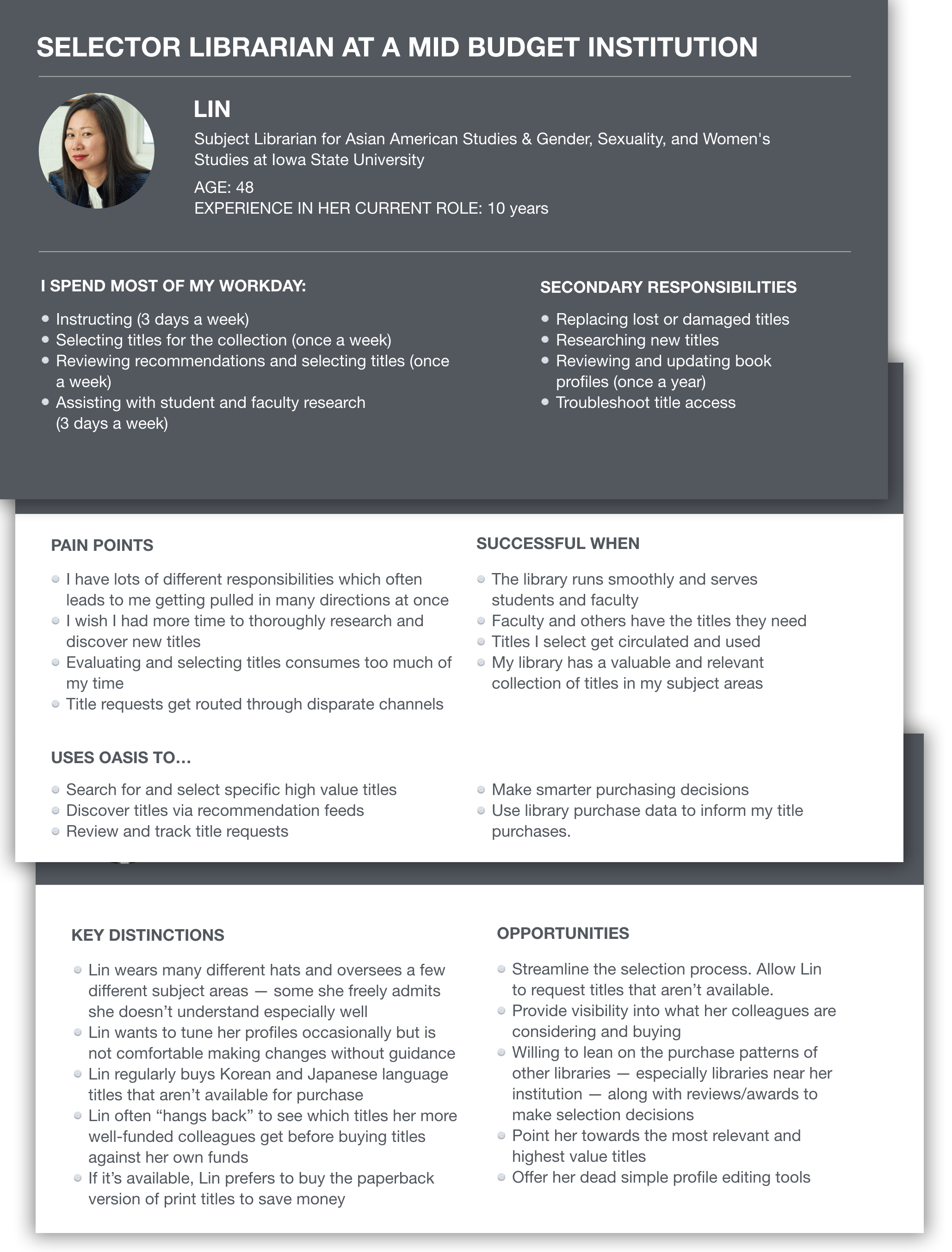
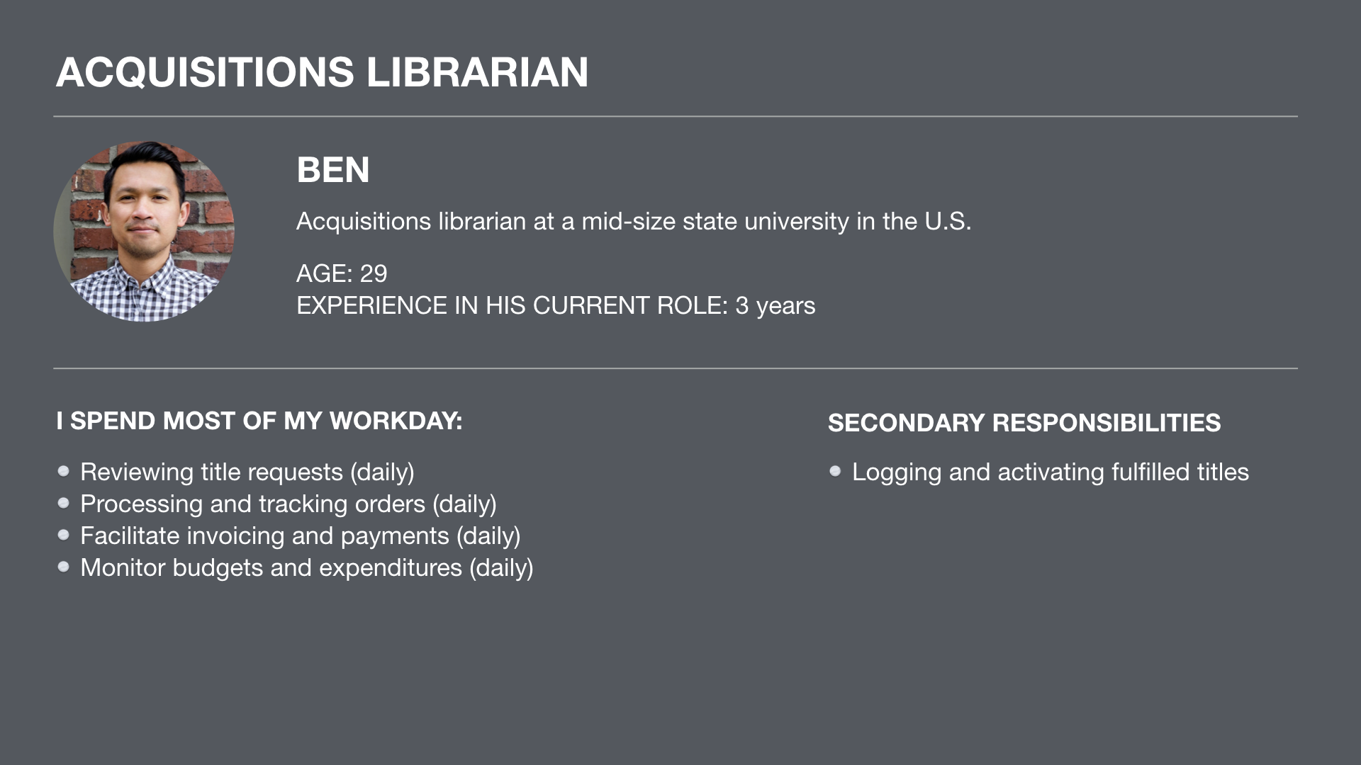
Secondarily, the new page design targeted Acquisition Librarians. Most often, these librarians searched for known titles that had been requested by students, faculty and other librarians. When evaluating a title, they focused primarily on a subset of fulfillment-related title information.
Design
The core design challenges focused on:
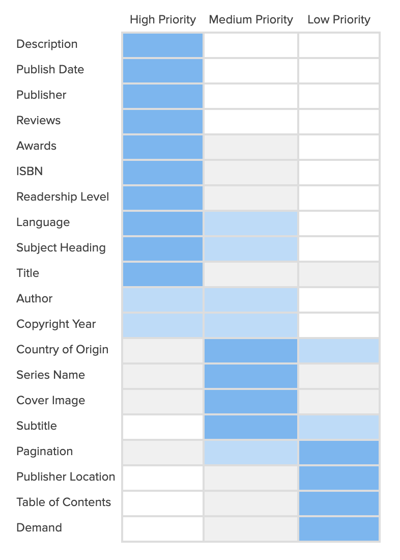
- Layering of title information. Titles sometimes carried deep channels of options and information which librarians often needed to explore in a progressive and intuitive fashion.
- Flexible and fluid title browsing. Librarians wished to access various pieces of title information in different ways. The new design needed to support a wide range of goals and behaviors which allowed the user to dig as deeply as she desired. Or hardly dig at all.
- Clean, scannable visual design. The visual design needed to minimize the cognitive load and communicate a wide range of information at a glance.
- Accommodate a wide range of workflows and goals. The product supported numerous types of organizational workflows and user types who sometimes utilized vasty different approaches to achieve their goals. Individuals sometimes considered vastly different sets of information and performed a range of actions on individual titles in accordance with their location and the needs of their institution.
- Differentiate the product through innovative and forward-facing interaction, UX and motion design.
Initially, during a site visit at Stanford University, I sat next to librarians in their offices and observed how they evaluated and chose titles. From these sessions, I was able to identify which pieces of information most often mattered most to librarians and better understand how librarians wished to evaluate titles before purchasing.
User Testing
I tested various iterations of the design with over 20 users in individual testing sessions. My testing regiment usually followed this pattern:
- Locate and recruit the most appropriate users. Usually, I’d contact Subject Librarians directly via email. I had to ensure to recruit from a range of libraries across various regions because the responsibilities and workflow needs could vary dramatically.
- Screen the users to ensure they had the proper qualifications and regularly engaged in the relevant workflows within the product.
- Schedule a one hour remote user testing session which consisted of:
- A half-hour of introduction and background questions where I’d probe their current responsibilities, library workflow needs and pain-points with their current toolset.
- During the second half of the hour, I would introduce them to the prototype and ask them to conduct a search for Library Science titles. I’d then ask them to evaluate all the titles and buy the most appropriate one based on the information that was presented to them.
- Follow-up with questions asking about their impressions of the new page, asked what they’d change about the new design and asked targeted cognition questions about certain design elements.
Learning & Iteration
I explored various design approaches with users which layered and displayed information using different techniques. One of the more challenging aspects of this design centered on offering quick direct access to deep pockets of information while keeping the browsing experience flexible, inobstrusive and easy to navigate.
Over time, I tested various browser and mobile interaction models and reshuffled the prominence of certain title details like Description, Awards and Reviews based on user feedback. Librarians consistently mentioned that those fields helped them decide on titles they felt less certain about and helped them identify higher value titles more quickly.
Solution
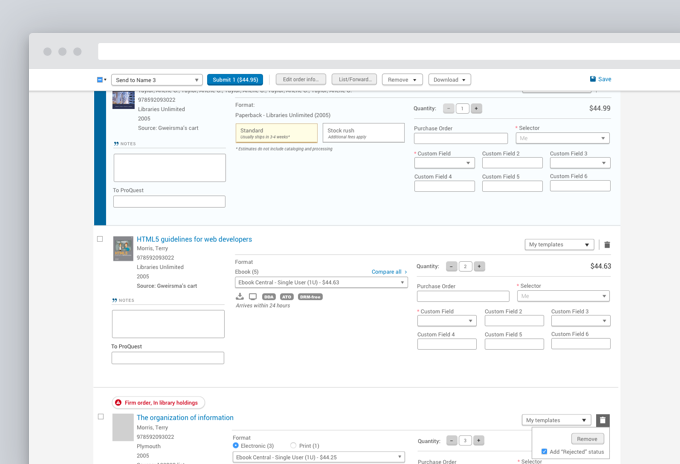
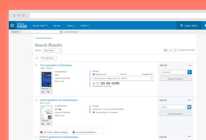
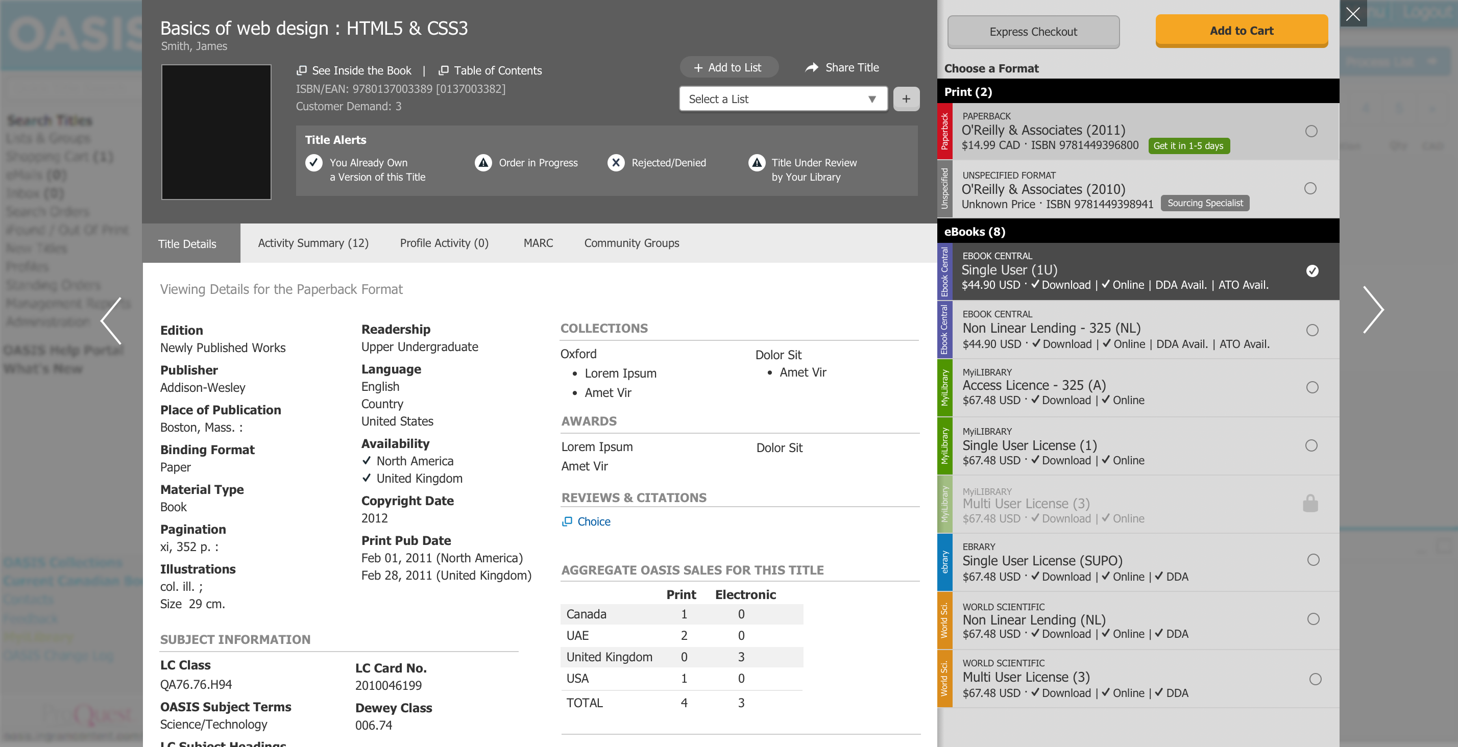
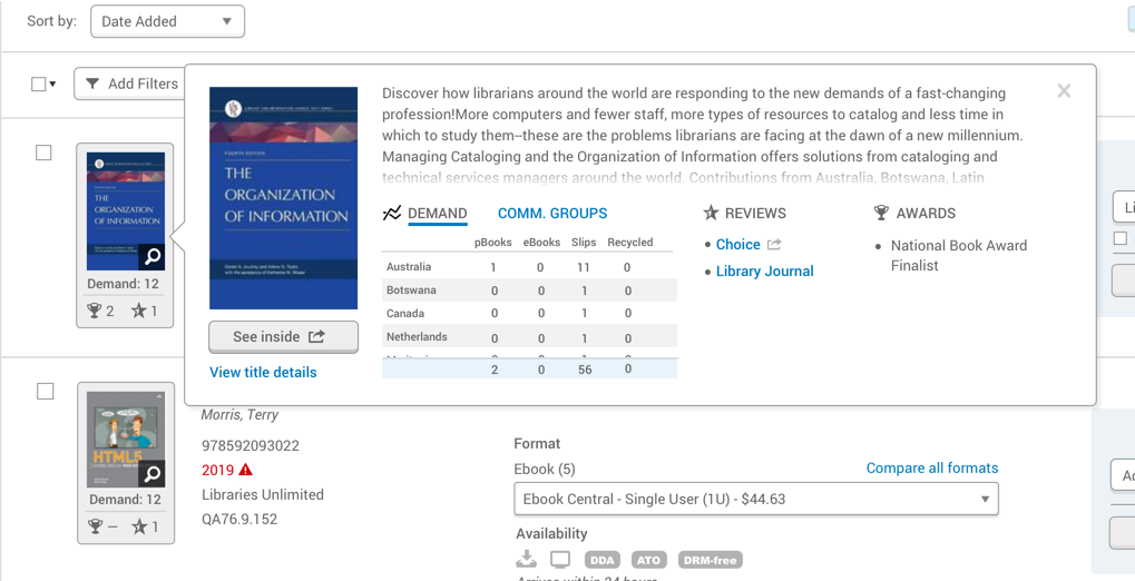
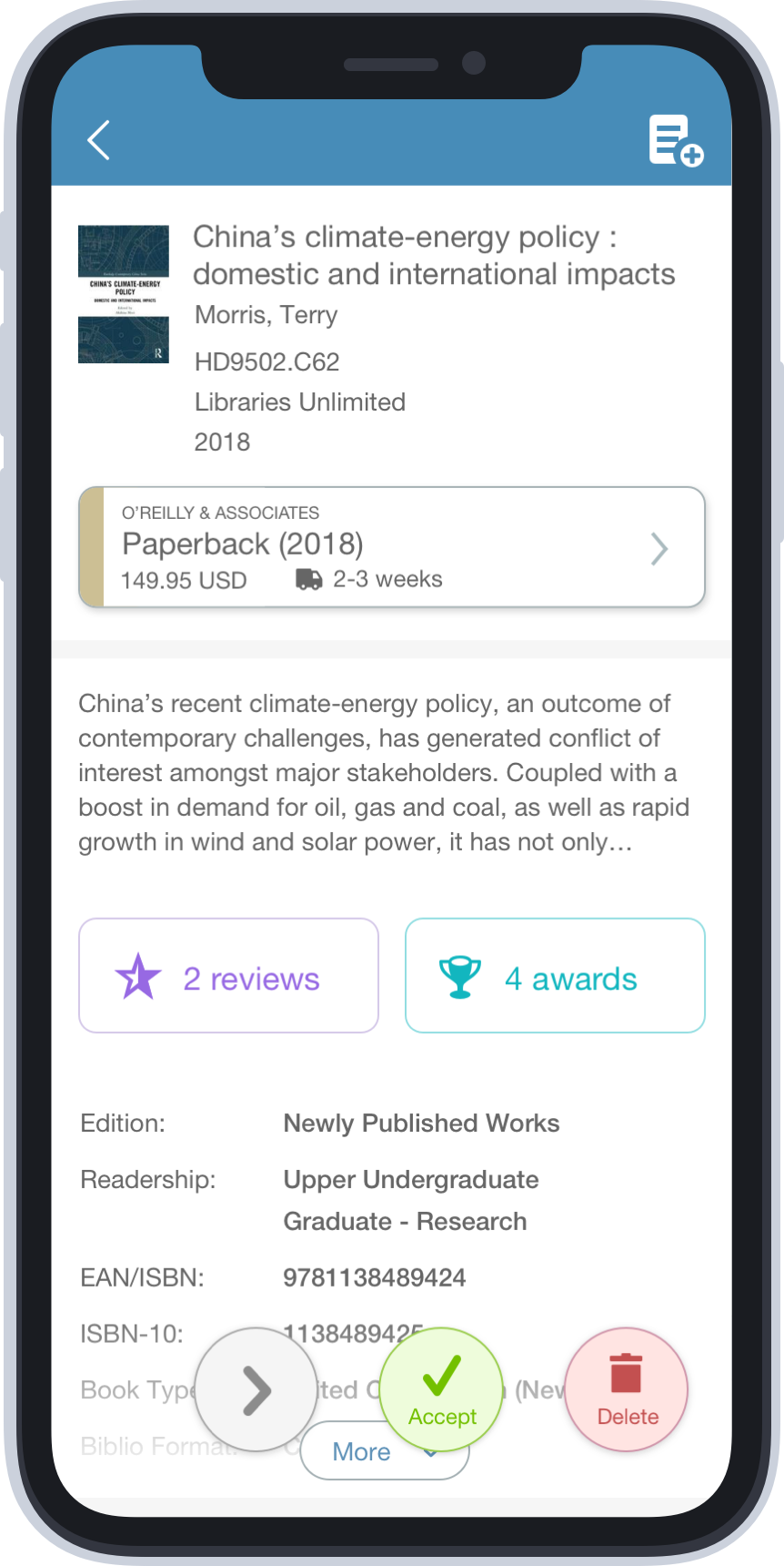
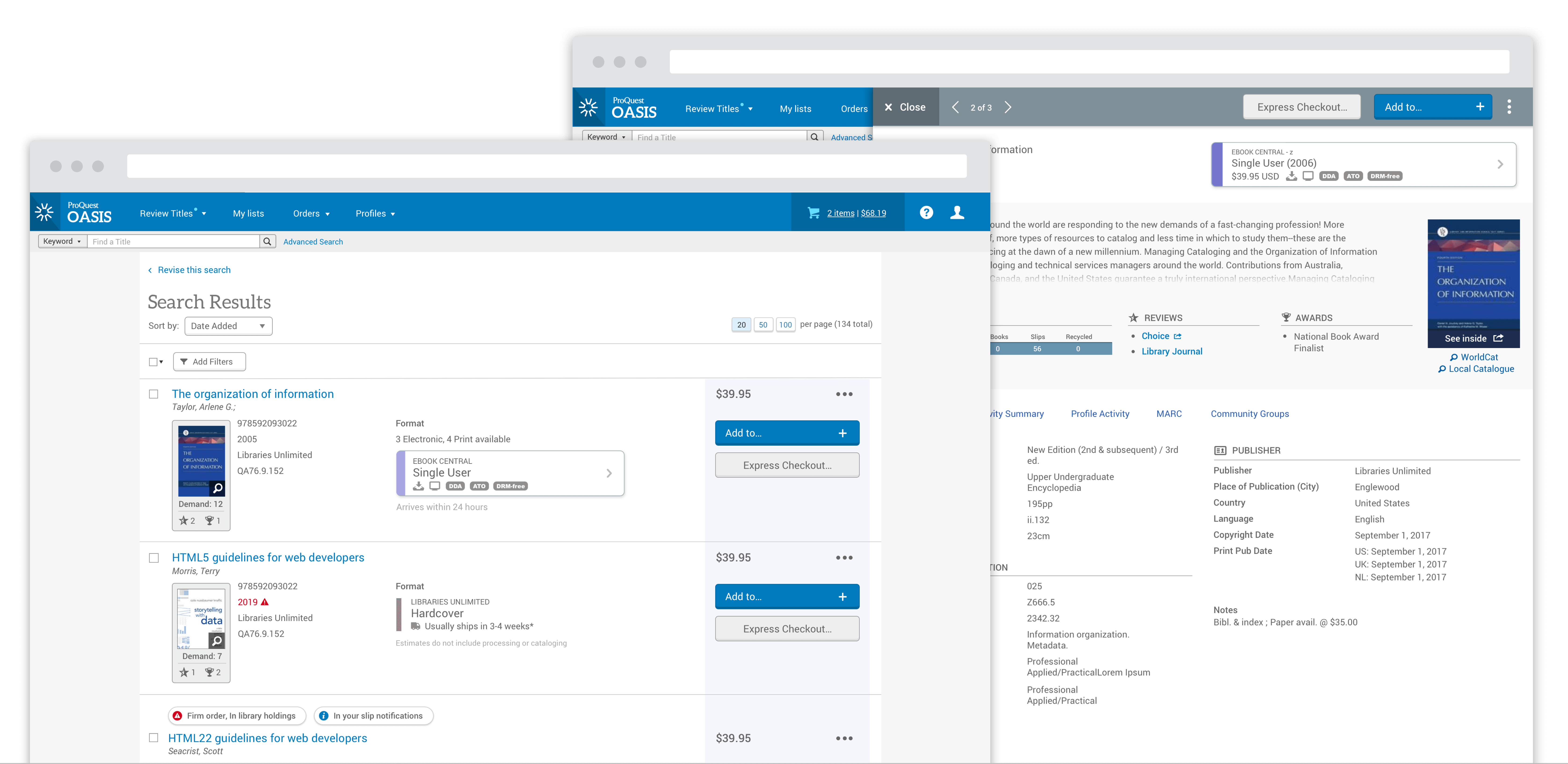
After considerable user testing and iteration, the design settled on a drawer interaction model along with a clean, attractive visual interface. I chose this model because it could display considerable title information while keeping the browse experience fluid and flexible. Librarians could seamlessly jump in and out of title details and not get locked into separate screens or rigid workflow requirements. Importantly, the interface offered lots of flexibility. Librarians could take an action on a title at any point in their process no matter how deeply they wished to dig into a title.
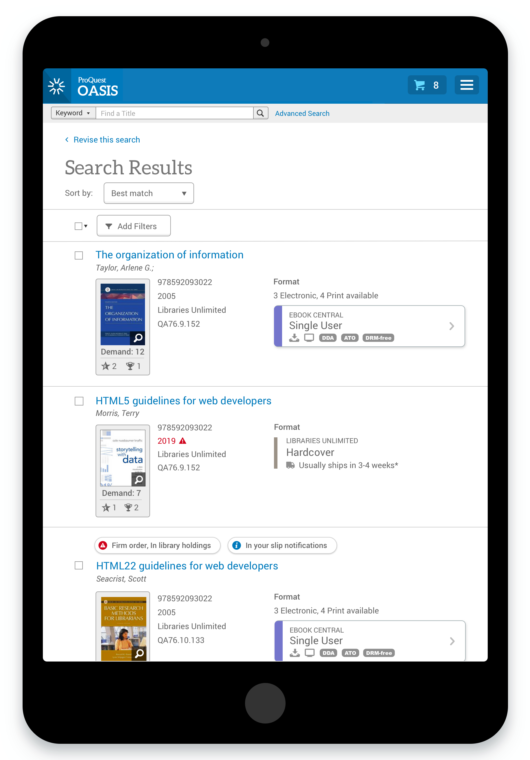
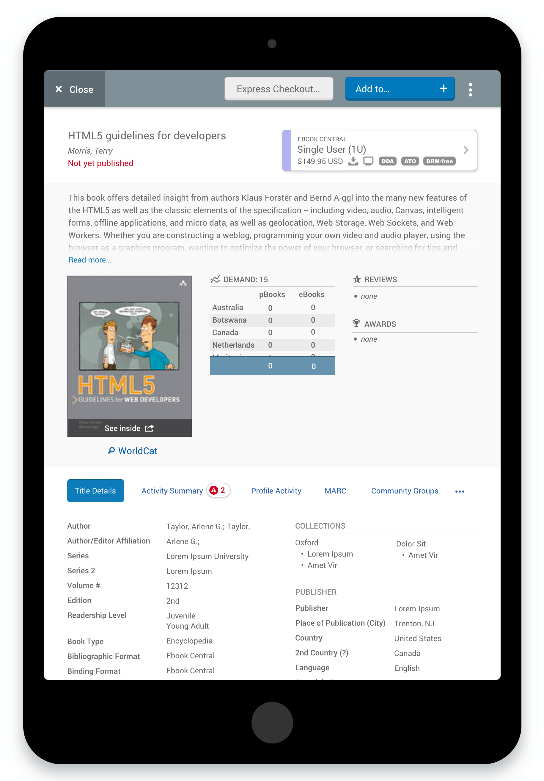
One key part of the design focused on the comparison of format buying options. I introduced a completely new visual language and interaction model to help users scan and quickly ascertain all her format buying options. Color-coding, iconography and typography helped the user understand and make a decision within a much shorter span of time. Titles could have as many as twelve viable buying options and the UX needed to make this evaluation process as easy as possible. Through user testing, the team was able to refine how users interpreted and interacted with the title buying options. Based on user feedback, I was able to consolidate the color options and determine users’ preferred display style.
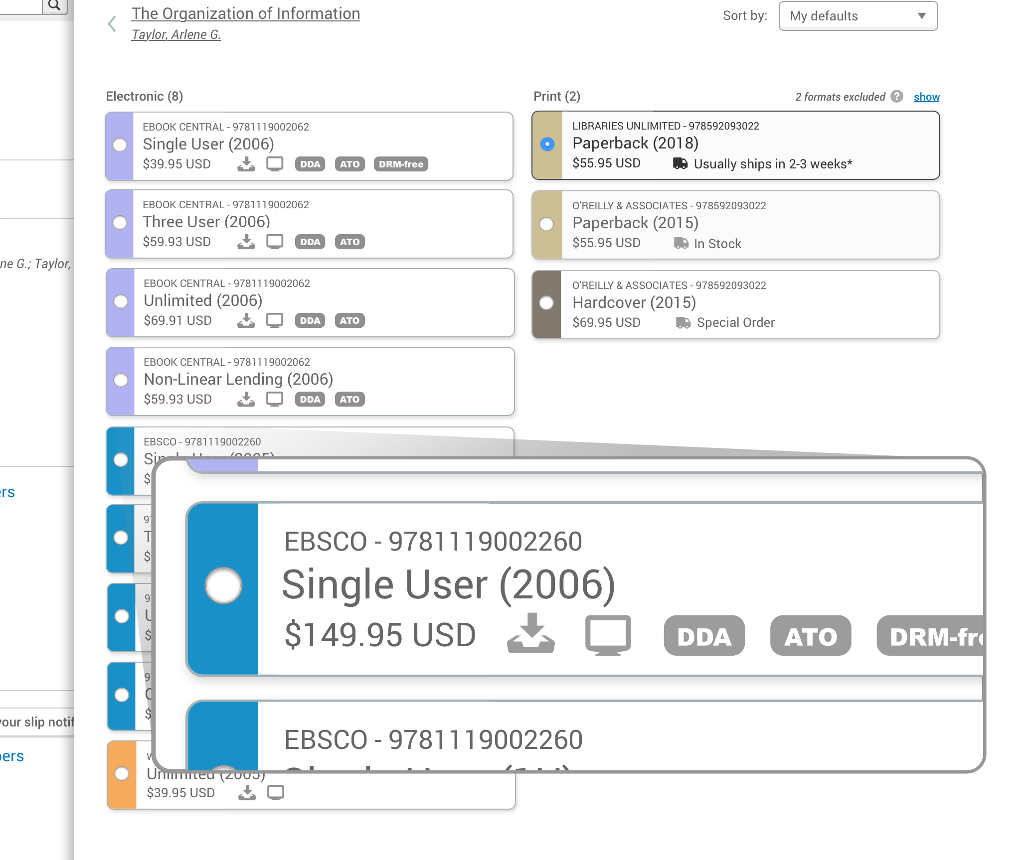
The team also explored an innovative algorithm which hid or de-emphasized what I called “junky purchasing options.” The product offered many buying options offered by unreliable vendors or had uncertain fulfillment times. Many Librarians refused to purchase these types of titles. By hiding these options in certain circumstances, the format comparison experience got decluttered and drove users to the most attractive and useful buying options.
Overall, the team gained quite a few insights into how librarians thought about and acted on titles. While we did make some critical changes during the testing process, overall, the new experience tested extremely well and got users excited about the future of OASIS. This new experience is currently in development.
Measuring & Quantifying Success
The product team established several customer feedback channels to measure the team’s progress:
- Regularly met with a User Group composed of librarians from 10+ Academic Institutions from around the world
- Monitored and acted on an Idea Exchange where any customer could login to submit and vote on product improvements
- Regularly contacted sales and customer service representatives
- Periodically sent out a surveys to all customers
The success of this feature will get measured by a periodic survey which tracks user sentiment in key areas:
- Net Promoter Score
- Number of clicks to complete common actions
- Overall user interface
- Search parameters
- Search results relevance
- System response time
- Title ordering process
- Title selection process
What I Learned
- Details matter. During some early user tests, librarians sometimes got tripped up with conflicting dummy data or had trouble evaluating titles outside of their area of expertise. I quickly learned to center the prototype around the user at hand. In some cases, I modified my prototype to address a single user’s unique scenario to ensure she didn’t get derailed by dissonant information in the prototype.
- Keep pushing ahead. When a designing for a complex interdependent ecosystem of features, it’s often time-consuming to prototype and test dramatically different UX approaches. Don’t settle for “nice.” Keep pushing towards a better solution even if it means retooling a complex prototype!
- Read between the lines. When prompted to provide feedback on the UI, users regularly requested additional features, complex data visualizations and other customizations which often didn’t add considerable value or solve pressing pain-points. It took exceptional focus and self-restraint to not accept those types of requests at face value. Instead, I explored what problem they wished to solve with their request and explored the level of value these types of feature requests might add.